|
|
Post by G on Jul 17, 2010 10:54:13 GMT -5
I've heard all the arguments against having text on covers and I could buy into the theories if I was getting great covers otherwise, but the fact of the matter is I'm not. As we have discussed in other threads comic covers have evolved into month after month of the same basic type of covers. Either you have a group fan out, collage, a stare down or a poster shot pose cover each and every month. The biggest argument I've always heard about having text and word balloons on covers is "It covers up the art" or "I don't want it muddying up the picture". Well being that I've seen the same type of covers now for most of the last 15 years and text has all but disappeared from covers, I'm one that would love to see it make a comeback. I think text from bonafide comic letters showed a unique creativity on comics. Besides a splash page, it may have been their one place to shine and to experiment. I always thought the text teased you and grabbed you in. It gave you a glimpse as to what you could expect if you laid down your dough for a comic. Creative text was part of the comic magic for me. Far too often comics have concentrated on the artist and/or writer being the main draw. But it really is a collaborative effort of everyone doing their job properly to make the whole thing work as a whole. Much like different instruments in a band. Sure it's all done on computers now, but why eliminate those with the talent's completely? If I get the same argument that I don't want to have my cover art cluttered, then I'm going to ask that they give me some different art on the cover. To be able to say with pictures so words aren't necessary. Because covers like this just ain't hitting it for me... |
|
|
|
Post by bigw1966 on Jul 17, 2010 11:12:44 GMT -5
y'know, the funny thing is is that lettering, especially Marque lettering is much easier and faster to do these days. Especially with a dedicated text program like the ones that I have.
Hell even inside of the books, many artists do not use text for sound effects anymore.
I for one always liked that stuff.
|
|
|
|
Post by cyberstrike on Jul 18, 2010 11:32:56 GMT -5
I miss it too when it's done right.
There are times when it was used it does seems overkill, even in the silver, bronze ages there were covers when the lettering, and text seemed useless. I have a copy of The Amazing Spider-Man #64 (I think) that has the Vulture attacking Spider-Man and it reads something to the effect: "The Vulture Strikes!" that text can makes the reader/buyer/fans feel like idiots. The reader/buyer/fans don't know who the villain is (and by the 64th issue the people who buy the book should know).
And sometimes the text makes no sense to the story. The Fantastic Four annual where Franklin Richards is born has some vague cover art and text saying something like "Where Life Is!" this tells me nothing about the story, now I would have put something "To save the Invisible Woman, Mr. Fantastic, The Human Torch, and The Thing must battle Blaststarr in the Negative Zone!" This at least gives me a clue what is going on (especially with that lame cover art).
But those are the exceptions to the rule.
|
|
|
|
Post by G on Jul 18, 2010 11:44:59 GMT -5
Yeah, that's what I mean too. When it is done right it can add to the covers, it can create more excitement. Usually when it is done wrong, it doesn't add anything to it. Sometimes it's kind of borderline. Take for instance Captain America (I think it is #106). It's a pretty cool Kirby cover on it's own and even though it's is rather an obvious statement, I think it added to the cover when they added the caption "Cap goes Mad!!!".
But I don't want to think in terms of strictly the way it used to be in the Silver and Bronze age, which I think for the most part did a wonderful job of adding lettering to a cover.
For me, I cannot understand why we cannot have the talents of today along with the technology of today taking a piece of yesterday and making it modern for today's books. Instead everything from yesterday including lettering and the way covers were done have been dropped. It could have been a progression and instead its became a departure.
Covers used to say things so well with both pictures and words. Now it is saying neither. I just don't see where that is progress.
|
|
|
|
Post by cyberstrike on Jul 22, 2010 9:37:20 GMT -5
Yeah, that's what I mean too. When it is done right it can add to the covers, it can create more excitement. Usually when it is done wrong, it doesn't add anything to it. Sometimes it's kind of borderline. Take for instance Captain America (I think it is #106). It's a pretty cool Kirby cover on it's own and even though it's is rather an obvious statement, I think it added to the cover when they added the caption "Cap goes Mad!!!". But I don't want to think in terms of strictly the way it used to be in the Silver and Bronze age, which I think for the most part did a wonderful job of adding lettering to a cover. For me, I cannot understand why we cannot have the talents of today along with the technology of today taking a piece of yesterday and making it modern for today's books. Instead everything from yesterday including lettering and the way covers were done have been dropped. It could have been a progression and instead its became a departure. Covers used to say things so well with both pictures and words. Now it is saying neither. I just don't see where that is progress. You'll get no argument out of me. 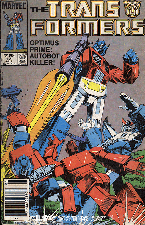 Marvel US Transformers #12 is one of my favorite covers that Optimus Prime shooting his fellow Autobots with text that said: "Optimus Prime: Autobot Killer!" that made me wonder what was going on, and want to buy and read the book. |
|
|
|
Post by G on Jul 22, 2010 19:34:23 GMT -5
Yeah, that's what I mean too. When it is done right it can add to the covers, it can create more excitement. Usually when it is done wrong, it doesn't add anything to it. Sometimes it's kind of borderline. Take for instance Captain America (I think it is #106). It's a pretty cool Kirby cover on it's own and even though it's is rather an obvious statement, I think it added to the cover when they added the caption "Cap goes Mad!!!". But I don't want to think in terms of strictly the way it used to be in the Silver and Bronze age, which I think for the most part did a wonderful job of adding lettering to a cover. For me, I cannot understand why we cannot have the talents of today along with the technology of today taking a piece of yesterday and making it modern for today's books. Instead everything from yesterday including lettering and the way covers were done have been dropped. It could have been a progression and instead its became a departure. Covers used to say things so well with both pictures and words. Now it is saying neither. I just don't see where that is progress. You'll get no argument out of me. Marvel US Transformers #12 is one of my favorite covers that Optimus Prime shooting his fellow Autobots with text that said: "Optimus Prime: Autobot Killer!" that made me wonder what was going on, and want to buy and read the book. This is a really excellent example and easily sums up a lot of what I miss about comics and wish was happening a LOT more today. I may have never collected Transformers, but a cover like this would have made it a real possibility that I would buy it. I don't know much about Transformers, but I can tell Optimus Prime is fighting his own kind. The cover shot alone is a selling point. It gives a glimpse of what you can expect to find out about inside. Then to top it off with the "Optimus Prime: Autobot Killer!" quote takes that leap of curiosity one step further. Its a great example of words and a picture teasing me to buy the book. I would buy it wanting to know WTF is going on here?!!! Covers like this take some forethought. It involves the artists knowing about the story. It involves him thinking of a way to sell that story to you. It involved a different kind of talent. If this same issue came out today, you would be liable to see Optimus Prime looking like a Valiant Poster Shot spreading out with his fellow Autobots spreading across the cover like it's the 4th of July. You would have ABSOLUTELY NO CLUE what the book was about! And it would just go on (not just with Transformers, but with just about all comics) issue after issue. I mean really when you think about it. Comics today could just as easily be coverless. It doesn't take the artist any knowledge of knowing the story. No forethought or planning of how to sell this story to you. It no longer links the product to what is inside. It's no longer a Window to the Story. It's just a wordless wrapper these days. An extension of the Logo. Nothing more. |
|
|
|
Post by cyberstrike on Oct 1, 2010 12:47:04 GMT -5
You'll get no argument out of me. Marvel US Transformers #12 is one of my favorite covers that Optimus Prime shooting his fellow Autobots with text that said: "Optimus Prime: Autobot Killer!" that made me wonder what was going on, and want to buy and read the book. This is a really excellent example and easily sums up a lot of what I miss about comics and wish was happening a LOT more today. I may have never collected Transformers, but a cover like this would have made it a real possibility that I would buy it. I don't know much about Transformers, but I can tell Optimus Prime is fighting his own kind. The cover shot alone is a selling point. It gives a glimpse of what you can expect to find out about inside. Then to top it off with the "Optimus Prime: Autobot Killer!" quote takes that leap of curiosity one step further. Its a great example of words and a picture teasing me to buy the book. I would buy it wanting to know WTF is going on here?!!! Covers like this take some forethought. It involves the artists knowing about the story. It involves him thinking of a way to sell that story to you. It involved a different kind of talent. If this same issue came out today, you would be liable to see Optimus Prime looking like a Valiant Poster Shot spreading out with his fellow Autobots spreading across the cover like it's the 4th of July. You would have ABSOLUTELY NO CLUE what the book was about! And it would just go on (not just with Transformers, but with just about all comics) issue after issue. I mean really when you think about it. Comics today could just as easily be coverless. It doesn't take the artist any knowledge of knowing the story. No forethought or planning of how to sell this story to you. It no longer links the product to what is inside. It's no longer a Window to the Story. It's just a wordless wrapper these days. An extension of the Logo. Nothing more. In some (hell it might most) cases the covers are drawn by artists who are not drawing the issue or the series. IDW's new Transformers ongoing series had 7 covers drawn by Andrew Wildman who drew the last 12 (or their about) issues of the Marvel US Transformers the only problem was that his covers were essentionally one character standing, flying, or crotching in front of a generic background. Maybe with the exception of #4 which featured the character Thundercracker in the story the rest of his covers (and other covers really wasn't much of an improvement) basically showed various Transformers in their classic G1 apperences but had nothing to do with the story. I mean as just art I loved Wildman's work, but they were not great covers because they said nothing about the actual content in the story. |
|
|
|
Post by G on Oct 1, 2010 15:13:01 GMT -5
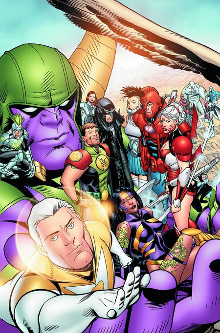
This has been my big complaint for literally years now. Comics has lost a part of them that truly used to make them great in my opinion. We go through life being told you can't judge a book by it's cover. Well, that much is true. But you really also can't judge the interior of the book when all the covers look the same. If every comic has the same pose and stare down or crouch shot which implies nothing about the interior story, what makes it stand out from all the rest of the comics doing the same exact thing? With todays covers, you can literally throw darts at 10 books and get 10 covers doing the same thing. When I was a kid, I could spend easily an hour just looking at the covers. Each one was a teaser. Each one was trying so desperately to sell itself to me. I would literally be torn with what books to bring home because the covers had me deciding which ones I wanted to read about the most on the little bit of money I had. It was painstaking sometimes. Now I'm just looking for familiar logos of title names I know and hoping the cover looks okay. No need to read it....there is nothing to read. No need to compare it to another book. They look the same. In this day and age where readership has declined to about 1/3rd to 1/10th the levels they were just 15-20 years ago, you would think somebody would say "Hey, why don't we try and be different than the other guys?" "Why don't we go old school and bring back teaser covers?" What is literally frustrating, is there is no doubt in my mind with the talent and the technology that exists today, we could be seeing some of the most awesome cover shots in the history of comics. And instead I'm seeing characters like Wolverine looking like he is straining to take a shit every time I see him on a cover. I really think if a company did old school covers right, they could be all the rage again. It's so original today it's ground breaking. I remember when Valiant hit it big, it was like all their covers were saying something. It was hot. Now it's like every cover is another version of Spawn #1. It's not working anymore. But the egos in charge keep thinking they are the draw and their same bullshit shots are the main draw and not competent work and interiors itself like it used to be. An artist today doesn't have to know anything about the story. And it shows. What would be ground-breaking today would be artists knowing what's inside the book and drawing a cover like they do and relating that cover to the story inside. But nah, lets have another cover like Image United instead.  I'm tired of being a sheep for these guys. I want MORE out of comics than the same ole same ole. |
|
|
|
Post by defiant1 on Oct 1, 2010 23:07:47 GMT -5
The collectors are too mature to have words on the covers they buy. They are connoisseurs of art. Seriously though, publishers are constantly looking for the easy sell. All those comic shop customers are like fish in a barrel. It doesn't matter what's on the cover, they'll buy it if they like the character.
A good analogy is when the card manufacturer's started removing gum from trading card packs because it was staining the cards. When I was a kid, I bought the gum and the cards were like a free bonus. The cards were a lottery gamble which usually sucked because I only knew the big stars in baseball. If I didn't get their card, then I was disappointed.
The problem is that the comics industry is always trying to second guess what the collectors collectively want and they've thrown all the sound logic about marketing out the window.
It's like when a guy tries to be all agreeable and do whatever his wife wants when all she really wants is for him to have a spine and stand up for his own opinions. The comics industry needs that spine to run the business as it should be run without constantly looking at popularity rating on their titles.
They cater to a squeeky wheel, that loud minority, and kick the rest of us out in the alley.
df1
|
|
|
|
Post by G on Oct 2, 2010 0:04:15 GMT -5
The problem is that the comics industry is always trying to second guess what the collectors collectively want and they've thrown all the sound logic about marketing out the window. It's like when a guy tries to be all agreeable and do whatever his wife wants when all she really wants is for him to have a spine and stand up for his own opinions. The comics industry needs that spine to run the business as it should be run without constantly looking at popularity rating on their titles. They cater to a squeeky wheel, that loud minority, and kick the rest of us out in the alley. That's one reason why I want to talk about it. Because it appears people have forgotten how it used to be and are content with it as is. But the numbers show they keep losing people. What's troubling is I've been following some of these guys on twitter and watching them self promote themselves and it makes me nauseous. It's like the same 10 guys who have a little bit of pull keep going.... "I just teamed up with (insert like-minded artist) on the cover to (insert usual books). I must say, we did a great job together!" The egos of these guys are amazing. They don't seem to talk about what the story is about. They don't tell you what the cover looks like or even care. If they do, its a link to the cover and when you look, you've seen it before. But in terms of telling readers what the book is about, its more often a case of "Can't wait for you guys to see what me and (so and so) came up with". These guys need someone new to come in and show them how its done. They need their collective comic's ass kicked. They all have boners over themselves. They don't even care about what comes out as long as their name is on it and you think that is the main reason to buy. Back in the day, it seemed like a book came out and you got it and then discovered who did it. Today its....you're supposed to care they did it and worry about the story and art later. |
|