|
|
Post by G on Feb 18, 2010 21:05:34 GMT -5
I went ahead and took the liberty of copying your pic that was deleted from your previous picture from earlier in the thread that was still working. I suddenly realized that was the pic that was missing, so I replaced the missing pic, but as you can see, it is out of proportion with the other pages. So even though it is back to existing, it still doesn't have the dimensions of the other pages. You'll need the reupload link for that. But for the time being, I hope this will do.
|
|
|
|
Post by G on Feb 18, 2010 21:31:41 GMT -5
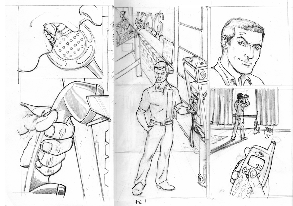
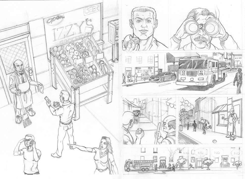
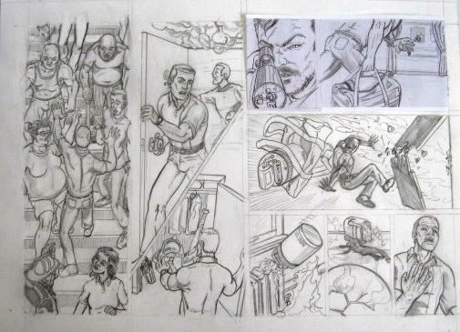
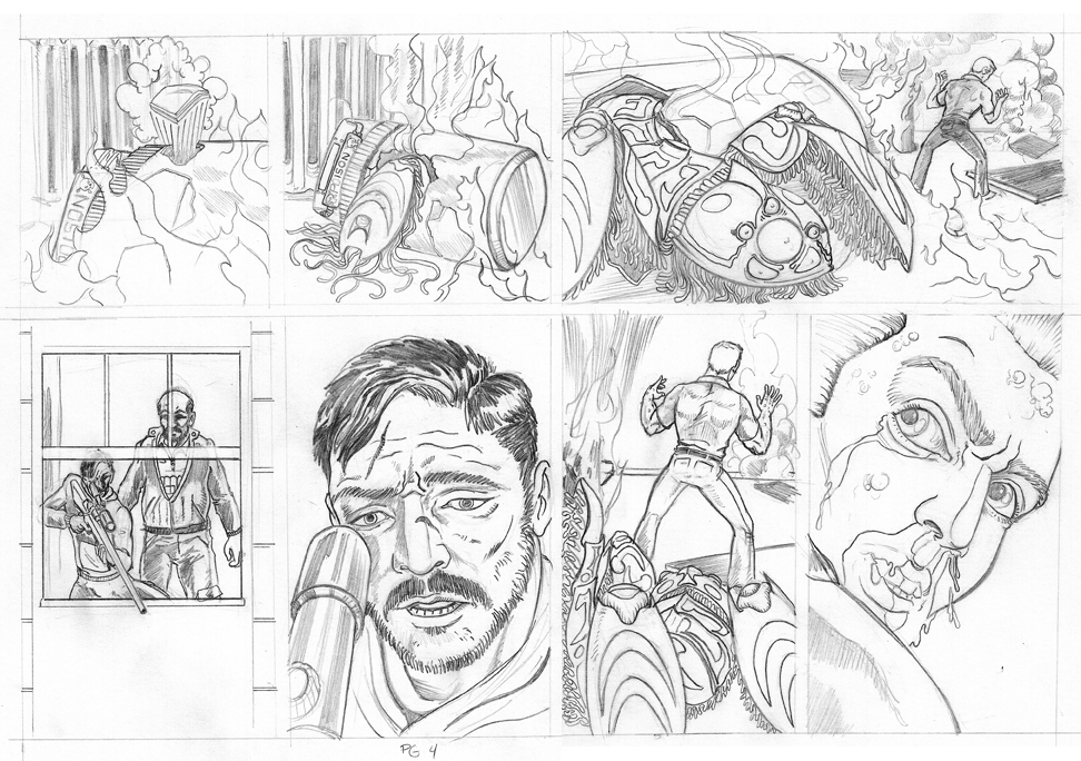
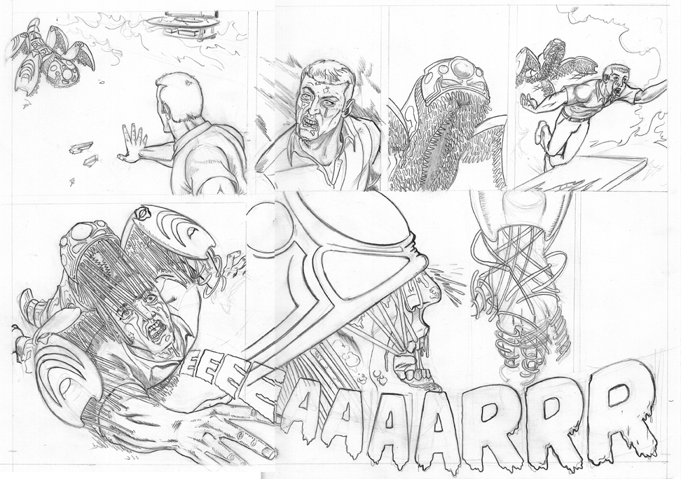
Rather than focusing on what I don't like, I thought I would point out what I DO like. While I may touch on what I don't like in small portions, I think it's better put to say what I do like. For me it isn't any one element that is making or breaking it for me. For me, its a varying degree of quality that kind of distracts me. I see what I like to see in spots and I know you're stretching boundaries, but in other panels I feel you could have drawn it differently or with more emphasis or chose a better shot. It's not bad as it is, it's just that the other panels are so much better. My favorite panels are as follows: Page 2 panel 1: Great overhead, perspective and composition. I feel like I've seen your Jarvis-like character before. Page 2 panel 3: Nice, great detail and believable shot. Page 2 panel 5: Although I'm not too excited about the characters in this shot, I love the streetside cityscape. Page 2 panel 6: I like the elements and placement in this pic but I think it needs more filling in. Its kinda basic, but the way you put it in there works for me. I just want a tiny bit more. Page 3 panel 1: I love the viewpoint and how much you got in to this pic, but I'm not wild about some of the faces. It looks a bit too cartoony for me. But overall, I think its a very well done panel. To the right of that, I'm going to count that as panel 2 and 3 (vertically) so next to that... Page 3 panel 4: This kinda reminds me of old Perez a little bit. Simple, but I like it. Page 3 panel 5: Somehow the crop actually helps the drama here. I got the sense of running here. Page 3 panel 6: I dig this pic! Lots of movement. I could say lots of good and a couple of bad things about the rest, but it's not necessary. I think page 2 and 3 are my favorites. It feels like you got in a groove there and 1, 4 and 5 are good, but don't excite me as much. I think part of my problem with page 4 and 5 is the alien being attacking the human. I've seen this kind of villain before (not sure where), but it looks familiar. And although you draw it real well and the effect of the monster grabbing the human is nicely done, I'm just not a fan of this Alien (or whatever it is) life form. If you were told to draw it like that, than I think you done well. And I do think you drew it well. It just isn't my cup of tea and its my own personal problem more than it is anything you drew bad. It's just not my favorite kind but I think you did it well. So that is why I point to 2 and 3 as my favorites because I know you well enough to know when you put extra into it and when you didnt. And some of the panels there stick out to me more than others. Anyway, the pages are far more positive to me than negative and I want you to keep going at it BigW. Can't wait to see more ! |
|
|
|
Post by bigw1966 on Feb 19, 2010 19:19:23 GMT -5
Thanks for the input guys. @defient1; Are you talking about the panel where the guy is looking back over his shoulder to see whats behind him? If so, I had to shape the eyes like that becauase of the angle of his face. The real problem though is that he should be looking downward and is instead sort of looking up. I need to change that, Just like I have to make the head larger in panel 4 on page 1. His head is to small for his face. No way a brain could fit. @gowaltrip; The familiarity you are habving is The guyver. An old Manga that was made into a movie with MArk Hamill. That was about an Alien Bio-super suit. It had a couple of different sized eyes. That is the only place. But, this is not a villain. It is a parasite He is not a new character or a superhero. This will be a straight up sci-fi/horror story. In fact, this guy here that is getting taken over does not have a pretty ending. In fact on page 6 the change continues and I just finished drawing him puking up blood and some other stuff. And it is about to get very violent.  Also On page two, that is actually two seperate panels at the top with the guy eating the apple and the guy looking through the binoculars. I will just be glad to get past the first 8 pages. Then I can open the story up some. I have to fit a certain amount of narrative into the first 8 pages in order to have a chance with the contest. |
|
|
|
Post by defiant1 on Feb 19, 2010 19:31:40 GMT -5
I reuploaded the page, but it is the same one that I posted a few days ago. Weird. When you reupload, make sure you use the NEW link to your pictures. What I meant by reupload was, reupload to Photobucket the 1 offending page. When you do that, use the NEW link it creates and edit your post with the new link. I cant see any reason why the original was deleted, so it could have been a mistake or some fluke. If so, a reupload should bring your pic back and not be deleted this time. From my experience, photobucket gives you the same link if you delete one and then upload it with the same file name. df1 |
|
|
|
Post by defiant1 on Feb 19, 2010 19:47:09 GMT -5
Thanks for the input guys. @defient1; Are you talking about the panel where the guy is looking back over his shoulder to see whats behind him? If so, I had to shape the eyes like that becauase of the angle of his face. The real problem though is that he should be looking downward and is instead sort of looking up. I need to change that, Just like I have to make the head larger in panel 4 on page 1. His head is to small for his face. No way a brain could fit. @gowaltrip; The familiarity you are habving is The guyver. An old Manga that was made into a movie with MArk Hamill. That was about an Alien Bio-super suit. It had a couple of different sized eyes. That is the only place. But, this is not a villain. It is a parasite He is not a new character or a superhero. This will be a straight up sci-fi/horror story. In fact, this guy here that is getting taken over does not have a pretty ending. In fact on page 6 the change continues and I just finished drawing him puking up blood and some other stuff. And it is about to get very violent. Also On page two, that is actually two seperate panels at the top with the guy eating the apple and the guy looking through the binoculars. I will just be glad to get past the first 8 pages. Then I can open the story up some. I have to fit a certain amount of narrative into the first 8 pages in order to have a chance with the contest. Let me start by saying again, you did some impressive stuff there. That being said, the character looking back has eyes that are too big. The iris is huge in that panel. The other character looking straightforward has something funky going on with his. I'm thinking there is a little too much symmetry per individual eye or something. He's looking worried and I assume that's intentional. If so, you did a great job with that... but the taper it seems a little off. I used to really like the way Herb Trimpe drew the Hulk, but the way he drew eyes bugged me quite a bit. It wasn't until I saw a picture of him that it made sense. The eyes he drew looked like his. The problem is that eyes should have some degree of variation per character yet still be true to natural proportion, shape etc. Overall though, damn good work. To me, eyes and hands are the most important things an artist can draw to convey emotion, intent, personality etc. That's one thing that bugs me about John Byrne after all these years. All the facial expressions look the same from character to character. He's not injecting enough individuality into his characters anymore. df1 |
|
|
|
Post by G on Feb 19, 2010 20:32:17 GMT -5
When you reupload, make sure you use the NEW link to your pictures. What I meant by reupload was, reupload to Photobucket the 1 offending page. When you do that, use the NEW link it creates and edit your post with the new link. I cant see any reason why the original was deleted, so it could have been a mistake or some fluke. If so, a reupload should bring your pic back and not be deleted this time. From my experience, photobucket gives you the same link if you delete one and then upload it with the same file name. df1  Eh, I'm sure you're right. I was just assuming because I never had to do it myself. It is odd that the same picture is posted just a few messages before hand and shows up fine, while a copy of it showed up as an unacceptable photo from Photobucket. Same picture. Doesn't make any sense. So I just replaced the working link with the one that wasn't working. Looking back, I think the link was slightly different when I replaced it. I remember he showed us that one single page and then came back days later and downloaded the multiple pages. Perhaps that batch upload created a different link. In any event, If the file name invokes the same link when reuploading (which makes sense when I really think about it), than a rename of the file and a reupload should solve it. But as it is, it's showing up now. So no need for it unless BigW wants the pages to all look uniform in size. |
|
|
|
Post by bigw1966 on Feb 20, 2010 11:23:01 GMT -5
The picture of page 3 that you copied and pasted is NOT the same one that was deleted. Its the same page, It came from photobucket, butit was a photograph that I took and uploaded. The deleted page was an actual scan of the page itself. I haven't bothered to reload it.
@defient1; There was no need to defend what you said, since I did not disagree with you. I merely pointed out that what is worse than what you mentioned is that the character should actually be looking towards the floor instead of up high since what he is looking at is down low.
As far as the pupil goes, It may be a bit big in realistic terms, but I when drawing it was also thinking of the final piece which would be colored so the room is filled with smoke from the fire. That would make the room darker and thereby cause the pupil to open so that more light can enter. If is was a bright setting, the pupil would be so small that it may not be noticeable. Like in panel 2 on page 2 where the character is on the street in the bright sunlight. I opted not to draw the pupil in those eyes(which may be what was throwing you off about them) because when the page is formatted it would be to small to make out that detail. Plus they can be added later.
Finally, I used a mirror to get the shape of the eyes (my sexy baby blues to be exact) when you turn your head to look over your shoulder, the muscles in your eye lids actually stretch your eye lids into an elongated diamond shape. While the eye itself pushes forward out of the eyesocket in order to get a clearer view. Also, the eye is not perfectly round. The actual Iris, the colored portion is actually protected by a convex shaped lens that allows light to come in from about 220 degrees of angle that lens also helps push the eyelids outward making that diamond shape I mentioned.
Sure I may have over emphasized them a bit, but I was trying to instill fear and confusion into the character. I mean, his apartment just blew up and he is also being affected by a nerve gas.
Maybe his eyes are doing a total Recall and busting out of his head.
I also agree that eyes and hands are very important. Especially in comics when you have limited resources for showing emotion within 2D characters.
Bottom line though, is that you guys were on point with what you noticed. Its ok though. some of the flaws will get fixed before I send it to the inker and others will just stay the way they are.
Luckily for me the pages are getting stronger as I go.
Like I said though, I will be glad to get past the first 8 pages. It was hard enough getting the story to have a good cliffhanger moment within an 8 page structure. Luckily I should be able to run the story for about 70 pages. Especially with some full screen spreads.
This wide angle layout is actually a bitch to format for unlike traditional layouts.
also, I gave up on Byrne years ago when it started to look like he was just phoning in his pages.
|
|
|
|
Post by bigw1966 on Feb 20, 2010 11:29:06 GMT -5
@defient1; I just realized the -other- character you were talking about is the middle eastern guy who was looking through the scope.
He is supposed to look both worried and slightly confused. I mean what would we look like if we had just seen what he was seeing. I was also keeping in mind how the facial muscles would efect the shape of the eye itself when he furls his brow. That and the head is at an angle so one eye is seated lower than the other.
I ws actually very happy with that panel lol.
|
|
|
|
Post by defiant1 on Feb 20, 2010 22:47:15 GMT -5
Sure I may have over emphasized them a bit, but I was trying to instill fear and confusion into the character. I mean, his apartment just blew up and he is also being affected by a nerve gas. Maybe his eyes are doing a total Recall and busting out of his head. I see so much terrible art that uses contorted, exaggerated, or just poorly draw eyes, that seeing small glimpses of that in your work just reminds me of all the guys that can't draw as well as you. That's specifically why I said 'take it to the next level'. An artist not only has to prove he can draw, he has to shed any stigma that his peers have delivered to the observer. To me, there is cartoon/caricature art, and there is serious art. Serious art can have a wide range of detail and quality, but to be treated as one who draws serious art, I think any artist needs to shed the desire to draw a caricature or exaggerated features in their work. If a comedian says there is a fire in his pants, it's unlikely anyone will take him seriously. Since caricatures are typically introduced for comedic effect, the same effect happens when an otherwise serious piece injects elements of caricature. It's kinda like mixing vanilla and chocolate. Chocolate overpowers vanilla and you have a less strong chocolate. The vanilla flavor you might have wanted is gone. df1 |
|
|
|
Post by defiant1 on Feb 20, 2010 23:06:36 GMT -5
@defient1; I just realized the -other- character you were talking about is the middle eastern guy who was looking through the scope. He is supposed to look both worried and slightly confused. I mean what would we look like if we had just seen what he was seeing. I was also keeping in mind how the facial muscles would efect the shape of the eye itself when he furls his brow. That and the head is at an angle so one eye is seated lower than the other. I ws actually very happy with that panel lol. I don't know what's bugging me on that one It sounds like you accomplished your goal. There is so much right with it that I can't pinpoint what I think is wrong. One thing that has nothing to do with your art, but it does remind me of art I don't like.... is the smug look on the character on page 1. The guy standing by the phone. A person can stand that way with their chest poked out and their back arched, but it's not a normal pose. It conveys confidence and arrogance, but it's completely overused. df1 |
|


 Eh, I'm sure you're right. I was just assuming because I never had to do it myself. It is odd that the same picture is posted just a few messages before hand and shows up fine, while a copy of it showed up as an unacceptable photo from Photobucket. Same picture. Doesn't make any sense. So I just replaced the working link with the one that wasn't working. Looking back, I think the link was slightly different when I replaced it. I remember he showed us that one single page and then came back days later and downloaded the multiple pages. Perhaps that batch upload created a different link.