|
|
Post by defiant1 on Nov 6, 2010 9:18:25 GMT -5
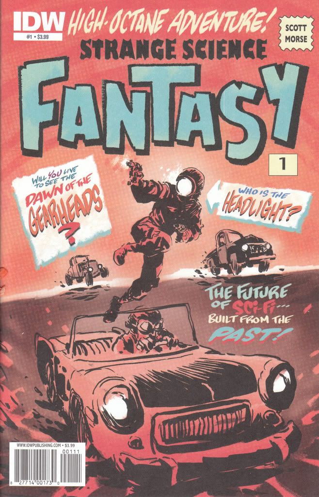
Strange Science Fantasy #1 IDW Story and Art - Scott Morse I can only think that my initial attraction to this book was the old style lettering on the cover. It looked like it was bringing back a glimpse from the past and the cover shot of this character Headlight looked both stupid and slightly interesting at the same time. Unfortunately, the cover tells you everything you need to know about this book. The art is this crappy throughout and told in pages with as little as 1 panel and as much as 3. The art is just slightly better than scribbles. The story is just as bad. Apparently the world has been reduced to nothing but a glorified Nascar race where there is no rules. Crashing and killing contenders is all part of the game. Enter headlight. For some unknown reason, he wins the races. This book moves along like you are supposed to just magically understand what is going on here or like you are supposed to care without any reason. Headlight's charm wears off as soon as you open the cover. There is nothing or nobody here to care about. There is no real characters to speak of. Just a mindless story going nowhere with art just as bad. When the best quality of the book is the paper it is printed on, you've got yourself a bad book. I can't see how this got published. This is one of those books that makes you realize what is wrong with comics. Standards are too low when a company like IDW lets something like this come out with their logo on it. My initial thought is to give this a 0.0, but having the belief that there might actually be even worse out there makes me be generous and give this book a 0.5..... I want my money back for this one.  "Scott Morse was trained at the California Institute of the Arts (commonly known as CalArts), where he majored in Character Animation. In his sophomore year he was hired out to work at Chuck Jones' Film Productions" By all means, close the school or refund his tuition. This should be published as a sketchbook, not a comic. Surely this guy can draw better than some throwaway project like this. Any theme that merges retro with future in a sci-fi story is written by people who don't know enough about science to write real sci-fi. df1 |
|
|
|
Post by defiant1 on Nov 6, 2010 9:29:48 GMT -5
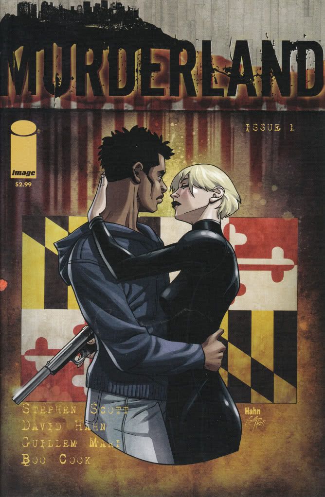
Murderland #1 Image Comics Story - Stephen Scott Art - David Hahn I tend to respect Image more when they get away from their core group of original characters. I find some of their other stuff is a far cry from the books I used to loathe so badly by them. Sometimes Image can surprise so I continue to give it chances. It's hard for me to judge Murderland yet. One issue didn't give me enough to pass total judgment on this. The story seems cryptic and wanting to fill you in as you go along. I would imagine the more you read this book the clearer it becomes. Best I can tell, the story revolves around the feminine character of Arabber who lives her life like an actress. She changes her looks and rolls at will. She lives the storylines and she prays on victims, like her seemingly indestructible black boyfriend who she looks like she kills in the opening scene, but we find out years later that they work together and sleep together and no matter how badly this guy is gutted, he lives. The ambush fight scene they become involved in is where the story gets murky for me. They proceed to kick each other's ass and the bad guy winds up in custody with a head halo on. When he is questioned, he proclaims "Go find yourself an Arabber". The issue ends there. I'm sure following issues fill the gaps on this storyline. There is probably enough here to make sense out of it all, but honestly, it doesn't read well enough 1st time through to take it all in immediately. The art is not bad. Tells the story well with good angles and atmosphere but done in a cartoonish and slightly manga style. Its just slight enough that it doesn't bother me. If the styles had been any stronger, it would have been a total distraction. As it is, its not bad. It's not great either. It works for the story. I would like to give Murderland a chance. It appears to have a bit of promise but I'm not willing to shell out more money on it to find out I was wrong. And it doesn't seem strong enough to make me think it'll be worth it even if I was right. I think my money is spent better elsewhere. I think some people will like it and some will hate it. I'd give it a 3.0....It wasn't bad. I think it just needs more pages to be read to like it better. It has potential. It also looks like it could go easily into the land of sucks. Issue #1 was just a tease. An incomplete. Not enough to truly judge it. Buy with caution. You described something in the vein of Morning Glories #1. I'll pass. I'm also tired of rewarding publishers with sales when they won't provide better artwork. I also think it's poor marketing to have the title blend in on the cover to that degree. The tile is the tool by which people will identify the product. df1 |
|
|
|
Post by defiant1 on Nov 6, 2010 9:35:37 GMT -5
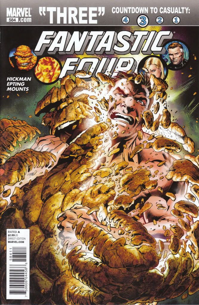
Fantastic Four #584 Marvel Comics Writer - Jonathan Hickman Artist - Steve Epting I have to admit when it comes to comics today, I find myself a tremendous fan of Steve Epting. Easily one of my favorite artist drawing today. When I heard he was taking the art chores of one of my collecting favorite titles, The Fantastic Four, I was more than a little excited to check it out. The story begins with The Thing trying a new serum which gives him back his normal human look for 1 week a year every year. The serum works and Ben and Johnny spend the day doing things normal humans would do. Ben soaks up the normal experience including kissing Alicia as a human and fighting the updated Yancy Street gang. Meanwhile Sue takes a trip and meets Cyclops, Emma Frost and most notably Sub Mariner. And lastly Reed has a run in with the Silver Surfer who is looking for answers on why Galactus was killed, only Galactus isn't killed. He's right there. This is how the story ends, with the Galactus moment being a cliffhanger. The story moved well, but seemed very loose. I read this in mere minutes. It was a bit disappointing. Likewise, Epting's art seemed a bit rushed. I'm used to his art looking far more photogenic than this. Luckily it got progressively better as the story went on, but overall I was a bit disappointed. He did a TON better on Captain America. I can only hope he picks it up as he continues on this series. Being I'm a fan of both the Fantastic Four and Epting, I was going in ready to give this one a knock out score. As it is, I'd have to give it a 3.0. Maybe a 3.5. The cliffhanger with Galactus looked good, but it wasn't enough to be overly impressed with this effort. I don't like the cover. I feel it's too busy. I did stop on this one and think... this is more like the art that comics need. Again, the cover is too busy. It looks sketchy. |
|
|
|
Post by defiant1 on Nov 6, 2010 9:41:06 GMT -5
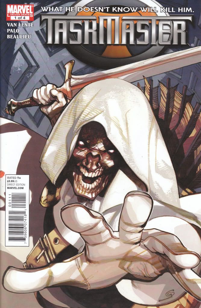
The Taskmaster #1 Marvel Comics Writer - Fred Van Lente Artist - Jefte' Palo The Taskmaster somehow appears as a civilian in a diner talking with a waitress about earliest memories. She confides in him and then asks him his earliest memory, he says coming in here. Seems the Taskmaster has memory problems but he's still able to recognize sniper gangs when they are waiting to get him. He sends the waitress off to ask the cook for a recipe and then all hell breaks loose as every group of bad guys are trying to collect on a bounty on The Taskmaster placed on him by the Org. This makes the waitress a innocent target as someone who appears to have connections with him. Just when things look bleak for her, Taskmaster saves the day. I gotta say, I'm not a fan of seeing bad guys play the role of good guys. This absolutely shows Taskmaster as an awesome kick ass, but the story seems better suited for a known good guy than the Taskmaster. It slightly takes some of the bad ass out of him. The art is another complaint. It's not bad and tells the story okay, but its way too stylized and comes off like so many crap comics copying crap styles. You take the stylized part of it out and he did a good job. As it is, it looks crappy to me. The overall book isn't bad, just don't want to see Taskmaster in this role and drawn this way. A good story gets dragged down with wrong art and wrong character. This makes me give it a 2.5. Could have easily been a 3.5 with different characters and artist. A sheep-herd type of book in my opinion. Baaaaaaaa! From what you describe, I think I'd feel the same way. You are nicer about the art than I'd be. df1 |
|
|
|
Post by G on Nov 6, 2010 23:20:42 GMT -5
Fantastic Four #584 Marvel Comics Writer - Jonathan Hickman Artist - Steve Epting I don't like the cover. I feel it's too busy. I did stop on this one and think... this is more like the art that comics need. Again, the cover is too busy. It looks sketchy. I have to admit to being disappointed. I've come to expect Epting to be very tight without giving me a feeling I'm looking at an Image comic. His Captain America was fantastic! I guess I was expecting more of the same. I also thought the cover was too sketchy as was the first couple of pages. Like I said, he seemed to get tighter as the story went on. I'm hoping that's a good sign. I also agree these types of covers are kinda what's needed. At first glance it looks like a typical pose cover, but in reality this is a legitimate "insight" cover as these very scene is inside the book. The last time I bought a Fantastic Four, which was just a couple of months ago, it also sport an even nicer insight cover by an artist who did a pretty bang up up job (I forget his name). It's good to see insight covers when you can find them. I've been seeing a few more examples of it. Still far too many pose covers that make me want to puke. But Id say the ratio of insight covers has been slightly up the last 6 months or so. It's still rare, but I've been seeing a few more. Its a welcome sight every time I see one. |
|
|
|
Post by G on Nov 6, 2010 23:25:04 GMT -5
Murderland #1 Image Comics Story - Stephen Scott Art - David Hahn You described something in the vein of Morning Glories #1. I'll pass. I'm also tired of rewarding publishers with sales when they won't provide better artwork. I also think it's poor marketing to have the title blend in on the cover to that degree. The tile is the tool by which people will identify the product. Book has sorta an "artsy college emo" type feeling to it. It hurts this book. It's like it's trying to be clever and cute. If this book cut the crap, it could be okay. I'm doubting though that it can pull off actually being a good a read. The clever crap is gonna end up getting too much in the way. |
|
|
|
Post by G on Nov 6, 2010 23:38:16 GMT -5
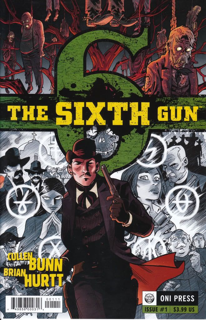
The Sixth Gun #1 Oni Press Writer - Cullen Bunn Artist - Brian Hurtt I can't stand the art on the cover. I don't care about the story when the art is that distracting. My first impression with the cover came off the same way. I think I wasn't expecting anything with this book and was sort of betting this would suck. I would tend to side with you on the art as I'd probably look at the cover and think it's bad too. But honestly, this art was very loose in terms of movement, tight enough in detail to tell a good story, and not stylized in such a way that I would want to puke. With attention to small details and vibrant non-plastic looking colors. Honestly, this had like a kick ass Jonah Hex grittiness meets 70's Marvel horror art feel to it. It moved VERY well. And in the end, I found the art a lot more pleasing than I originally anticipated. What I originally found distracting at first glance turned into things I didn't notice when the book read and felt like a good Western/Horror. I have a lot of books from the last year with technically better art, but make me want to commit suicide when I see it. I'd rather have books like this. I can deal with this and I enjoyed it. But this is only MY review. I don't expect everyone to agree with my reviews. |
|
|
|
Post by bigw1966 on Nov 7, 2010 11:12:30 GMT -5
The 6th GUN; First off, cullen Bunn is a hellluva nice guy. the book is very good. I have the entire run. It reads very well all the way through.
The artwork to me has a feel of Michael Avon Oeming (POWERS) meets Bruce Timm (Batman the Animated Series). That is a good thing as it allows it to seperate itself from other books on the stands.
Like defient 1, I am more drawn to artwork like Epting & Guice (who alternated on Cap art) but in my honest opinion, I would not want to see every comic drawn in a similer style to them. The reason is because not all books need to have that level of Art to sell it, and also because with a style like this one, which is a bit more animated, you can go much further with body language and action and character emotion. Its far easier to sell character emotion and facial expressions with a cartoony style rather than a totally realistic one. This is because people make very different expressions when they are angry for example to where the look on their faces are very different. Just like a fingerprint. Cartoony styles alow a more open and direct view of expression.
This is like Kevin O'Neill on League of Extrordinary gentlemen. He draws in an old woodcut style and blends a scribbly type of art in which really helps sell the era the book exists in. I honestly would never want to see a different artist on that title.
I agree mostly with your review of this one "G".
CROSSED: I highly recommend you purchase the TPB of the initial series by Garth Ennis and Jacen Burrows. Read all at once it is a riveting book. Its like seeing a car crash and being unable to turn away.
Not only does the story read extremely well, but Jacen Burrows is easily becoming in my eyes the best Artist in the Industry. His characters are spot on everytime. They actually emote. no stock poses or faces each one is unique unto themselves. Every detail you would expect to see n any scene is there and perfectly rendered.
I have not gotten any of the Lapham issues yet, but I am a huge fan of Stray Bullits and his batman work that when the TPB comes out I will have it.
TASKMASTER; I guess you are a bit unaware, but he has been becoming more of a grey area character for some time now. He has his mercenary school where he trains villains. He was an Instructor to the Avengers Initiative when Osborn was running things also.
The Idea behind him having amnesia and doing good deeds is far from new and is a good twist on the character.
The film "The long kiss goodnight starring Sam Jackson and Geena Davis was about an Assassin who disappears after a mission only to turn up later as a soccer mom living a quiet life because she has amnesia. Then the shit hits the fan as her memories return, and she is put in a position of deciding if she will return to be a murderous bitch or if she will go in another direction.
Same could happen for Taskmaster.
I like fred Van Lente but am unfamiliar with the Artist.
MURDELAND: Never read it and do not like the name.
Strange Science Fantasy: The cover reminds me of sketchy Frank Miller art.
I am just curios, since it is themed against the Idea of NASCAR, do all of the panels face the left?
Fantastic Four: I have been enjoying Hickmans run a lot since he came on. I am saddened by the fact that the awesome Dale Eaglsham is no longer on the book, but I enjoy epting. I like the cover quite a bit. It may look busy, but the subject of it is not one designed for simplicity. Also, it is very clear what is happening in it so I have zero complaints on it. I have not read any of this arc yet so I cannot comment on the story.
|
|
|
|
Post by G on Nov 7, 2010 13:58:11 GMT -5
The 6th GUN; First off, cullen Bunn is a hellluva nice guy. the book is very good. I have the entire run. It reads very well all the way through. The artwork to me has a feel of Michael Avon Oeming (POWERS) meets Bruce Timm (Batman the Animated Series). That is a good thing as it allows it to seperate itself from other books on the stands. Like defient 1, I am more drawn to artwork like Epting & Guice (who alternated on Cap art) but in my honest opinion, I would not want to see every comic drawn in a similer style to them. The reason is because not all books need to have that level of Art to sell it, and also because with a style like this one, which is a bit more animated, you can go much further with body language and action and character emotion. Its far easier to sell character emotion and facial expressions with a cartoony style rather than a totally realistic one. This is because people make very different expressions when they are angry for example to where the look on their faces are very different. Just like a fingerprint. Cartoony styles alow a more open and direct view of expression. This is like Kevin O'Neill on League of Extrordinary gentlemen. He draws in an old woodcut style and blends a scribbly type of art in which really helps sell the era the book exists in. I honestly would never want to see a different artist on that title. I agree mostly with your review of this one "G". 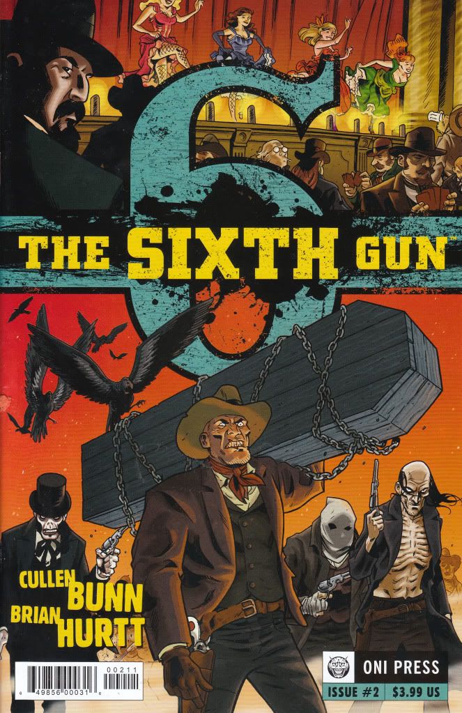 Here is the cover to my #2. Like I said, after reading both of these, I wish I had the rest. It was a good fun read. I also agree with what bigw is saying here. While I love Epting and his realistic style, I also wouldn't want every comic to be that way. This is a loose cartoony but certainly comic book style comic art. It does provide for great movement, expressions, storytelling and action. If it was more about the style than the art, I would have hated it. But the fact is, it is the art.....and yes......it has a bit of a style to it, but the great thing is, when I read it, it wasn't noticeable. What was noticeable was how great the art depicted the story and gave a great sense of watching a good flick. If it was just stylized with no substance, I would have dropped this book to a 2.0. The story on its own is kick ass and it deserves better than that. The combo of the art with the story makes it an easy 4.0. They both compliment each other very well. The art makes the story better. The story makes the art better. A win-win in my opinion. |
|
|
|
Post by G on Nov 7, 2010 14:06:44 GMT -5
TASKMASTER; I guess you are a bit unaware, but he has been becoming more of a grey area character for some time now. He has his mercenary school where he trains villains. He was an Instructor to the Avengers Initiative when Osborn was running things also. The Idea behind him having amnesia and doing good deeds is far from new and is a good twist on the character. The film "The long kiss goodnight starring Sam Jackson and Geena Davis was about an Assassin who disappears after a mission only to turn up later as a soccer mom living a quiet life because she has amnesia. Then the shit hits the fan as her memories return, and she is put in a position of deciding if she will return to be a murderous bitch or if she will go in another direction. Same could happen for Taskmaster. I like fred Van Lente but am unfamiliar with the Artist. Yeah, I'm not up on a lot of storylines and I freely admit that. But the last I remember, Taskmaster was a kick ass villain. I really have no desire seeing him play a good guy. It's like making Thanos good. It just dilutes the shit out of the character if you ask me. Sure, some have made the transition (like the Punisher), but that was a bit easier to envision. I'm just not interested in seeing Taskmaster in that gray area. In fact, seeing him in that light almost makes me not want to see him as a villain either. He can go away for 10 years now because he done F'ed up how I felt about him with this. Like I said, story....not bad. Wrong character though. Art....visually told the story and in that respect, it was well done, but the style totally blew chunks. I get the feeling we'll see more from this artist and of course in the same exact style and just like this one, I feel with the style he's using, he'll fuck up every book he touches. |
|