|
|
Post by G on Nov 7, 2010 18:56:02 GMT -5
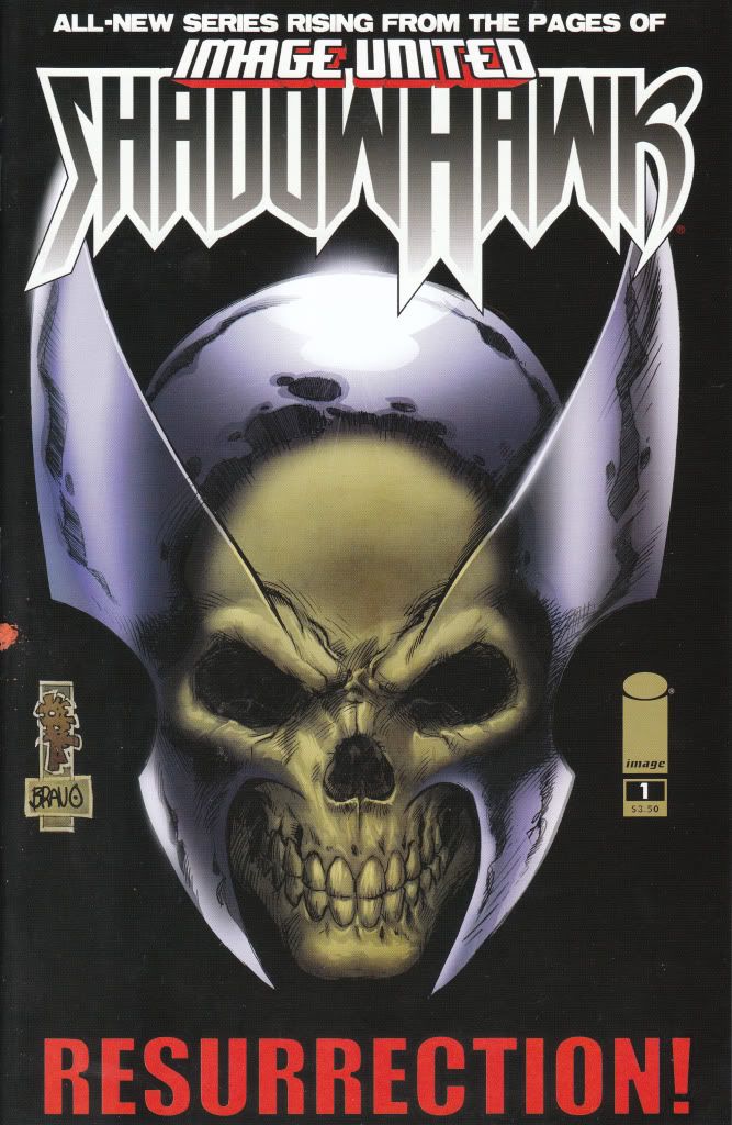
ShadowHawk Vol 3 #1 Image Comics Writer - Dan Wickline Artist - Tone Rodriguez I've never been a fan of Shadowhawk or really any of the Original Image characters for that matter, so I came into this story already set against it. I must have gotten a huge discount on this and felt willing to be open minded to give it a try and try it I did. Even though I knew I didn't like the cover and didn't care for the comic, I gave it a shot. It should also be obvious I don't know the history of Shadowhawk. So I read this story not knowing the facts of the character. From what I read, it appears the original Shadowhawk was killed and replaced and now he's back. I further gather that the original Shadowhawk was a gruesome vigilante who crippled those he felt deserved it, unlike his replacement who fought with more heroic ideals. This is the concept for the villain here known as Killswitch who apparently was the victim of the original Shadowhawk. Apparently he crippled the man inside the suit years ago. This victim sued the city for not protecting him from Shadowhawk and won millions. The millions were not enough to calm his soul, so he spent his millions creating his exo-skeleton suit so he could seek revenge for being crippled. That's about as deep as this comic gets. From that understanding there really isn't much of a story here. The two fight and Shadowhawk gets reminded of his villains past which makes him reflective about the person he used to be and who he is now. I guess its a heavy burden for a guy that used to be dead and is now back. The art is workman like and gets the job done. Nothing really special and nothing too bad either. No overdone Image styles here, just a decent job at the art. But just like the story, it's just a step below being anything you can feel good about. The whole comic comes off as being very amateur. It's feels like a comic put together by people who want try to be in comics and finally make a comic book. The story seems a step below being really good and the art follows suit. In the end, they end up with a finished comic and they pat themselves on the back for making a real comic book that gets published. You know the type. Right down to the completely unoriginal cover, that is what this feels like. A comic 1 step from feeling like the big leagues did it. A feeling subpar creators put their minds to it and created a comic book. To be fair, it may be just about the best Shadowhawk comic I ever seen. But to be further honest, I never liked a single Shadowhawk comic I ever looked at and I don't much care for this one either. It's not really saying much when I say this is about the best Shawdowhawk I ever seen when I still think it sucks. In the end, I'll give it a 2.0. Die-Hard Image fans would probably tell me to go to hell and I don't know shit about comics. However my 32 years of experience reading comics tells me it's all flash and no substance as usual. This comic will come and go and I'll have no reason to buy another issue or ever care about it in the future. Oh yeah, let me not forget there is a small backup story by original creator Jim Valentino on art and Steve Niles writing. The back up is worse than the full story, but still looks like a slight upgrade for Valentino. Hard to believe everything about a book could be better than what I've seen before and still suck. But Shadowhawk appears to have done just that. |
|
|
|
Post by G on Nov 7, 2010 21:41:51 GMT -5
Daredevil Cage Match #1 Marvel Comics Writer - Antony Johnston Artist - Sean Chen If you're going to make a one-shot for a comic, have it being more than a fill in anywhere else. Daredevil/CageMatch is one of the lamest stories I ever read. Teaming up together Daredevil and Cage do a little street patrolling. When Cage helps finish off a group of bad guys when Daredevil's in a bit of a jam, he gets his nose bent a little out of shape and say he could have handled it himself. This turns into a "I could out do you" kinda conversation and the next thing you know, they are challenging each other in a ring. Come on! This whole book has no purpose at all. The whole concept is a joke and makes both characters look like losers. Art is standard fair mediocrity and does nothing to enhance this dog pile of a story. This is when Marvel looks like shit. I'd give this book a 0.5 because there is no redeeming quality and I cannot recommend it to anybody. Totally sucked. |
|
|
|
Post by G on Nov 7, 2010 22:06:55 GMT -5
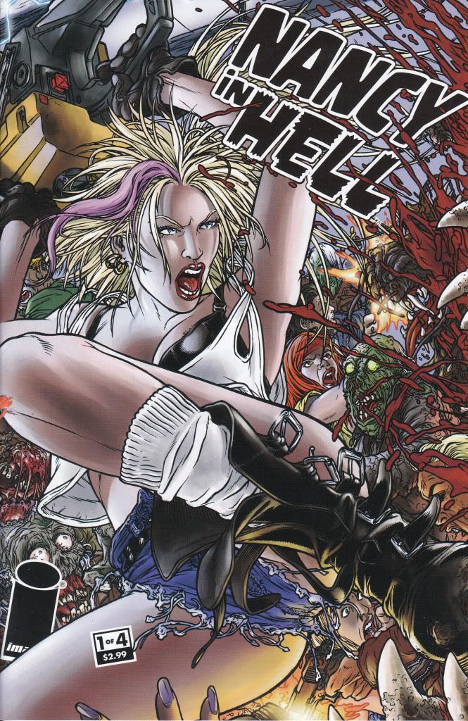
Nancy in Hell #1 Image Comics Writer - El Torres Artist - Juan Joes Ryp Nancy is like one of those bar bitches that might look good if you was totally fucked up, but when you wake up in the morning, you know she's a skank and your mother certainly wouldn't approve. Turns out Nancy has drowned and she's now in hell. During a peaceful moment in Hell's bar, she is given a pep talk that Hell can be a new beginning of sex, drugs, rock n roll and no rules to speak of. Aside from everyone in hell trying to take advantage or kill you, why don't you just enjoy it? For a moment, that segway had a bit of potential, but honestly it was all downhill from there. Nancy in Hell is little more than a T&A story in hell trying to look cool with demons and sluts. Would have called the art above average but in the end it ends up being too stylized and bothersome after awhile. I've seen this kind of art before, but I've seen it done better. Honestly, its pretty good art, it's just annoying after awhile. As I said, Nancy in Hell seemed to have potential after the opening scene, but quickly degenerates into a mindless story going nowhere in the end. I'd give it 2.0 because it was almost decent and at first glance the art aint bad. It just never seems to get over the hump and be anything worthwhile. Good for T&A, gore and Demon looking characters but not much else. |
|
|
|
Post by G on Nov 8, 2010 12:54:34 GMT -5
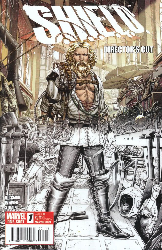
Shield Director's Cut #1 Marvel Comics Writer - Jonathan Hickman Artist - Dustin Weaver Leonid has been told all his life that they will come for him and finally they have. He is taken to a secret location and introduced to a secret society of all knowing council, the Shield. He is given glimpses of events from famous people of the past who knew they all had a purpose, because this is not how the world ends. Leonid asks what is his purpose and what must he do? He is told he must join them and does. Leonid has a special gift, a special power that has not yet been revealed to us. Finally, it happens. His father comes calling with a key to an eternally locked gateway. He opens it and tells him to go meet with his destiny. When Leonid gets to the top, he finds the past is there waiting for him to arrive. This is the end of the issue. The Shield is a reminder of how great Marvel can be when all the stars line up and and all the best creators are given a chance to tell a story like it should be told. The art is fantastic and highly detailed. The book makes you asks questions and you wonder where this is all leading. The book possesses all the elements that make comics worth wanting and continue reading. You are left wanting to learn and see more. That's really all I can ask for in a comic. It reminds me of the way I used to feel when reading comics. I'm gonna give Shield a 4.5 because this is about as good as comics get these days. When you wade through so much that falls short and even becomes irritating, its nice to see a book just be done right. I'm sure some will not like it and maybe that is why it doesn't achieve the nearly impossible 5.0 status. Maybe seeing characters like Newton and Leonardo Da Vinci is not their cup of tea. Other than Galactus, there really isn't characters appearing who are familiar to us. Maybe that will be a short coming. But it isn't for me. For me it was nice to see good work when there is so little I would classify is good work. This to me is good work..... |
|
|
|
Post by G on Nov 13, 2010 20:41:40 GMT -5
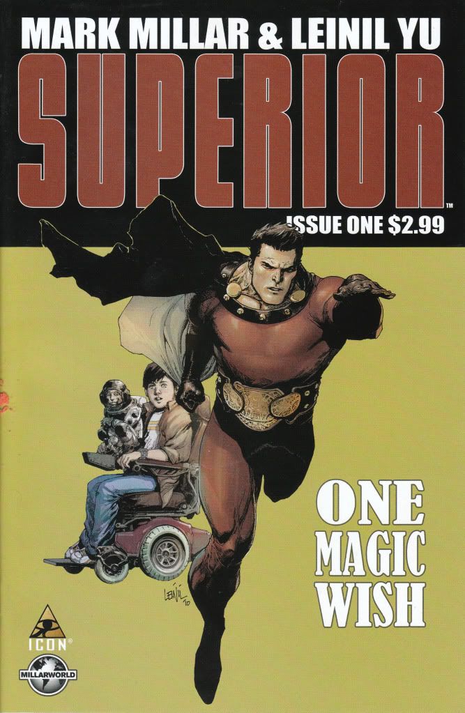
Superior #1 Marvel (Icon) Comics Writer - Mark Millar Artist - Leinil Yu Young Simon has Multiple Sclerosis. He spends his weekends going to movies with his best friend Chris. Chris appears to ignore the MS and does what he can to be a friend. Some kids like to pick on Simon because he has MS and it's easy to joke and bully about. Chris gets picked on too because he hangs out with Simon. The movie starts out with the two watching a super hero movie about Superior. Simon likes that Superior is all heroic and does good deeds. Chris thinks Superior is outdated and too goody goody compared to today's comic stars (sound familiar?). Later as Simon sleeps he is awakened by a Space Monkey and told he is the chosen one. Within the blink of an eye, Simon becomes Superior. Not knowing how to deal with it he runs away and his mom worries. Superior goes to the only person he can trust.....Chris. That's about the gist of this story. It has nice pacing and reads well, but I have to admit the Space Monkey was a bit too much. If they would have took that out and made it another device for the transformation, it might not of felt so corny. As it was, it was decently enjoyable. Yu art was easily noticeable as I read the story. I have mixed feelings about his art. I think his layouts and storytelling is great. I think I get a bit disturbed by his self inking pencils. When I seen his work on Secret Invasion, it was a lot more distracting than it was here. But it's still not a favorite style. He kind of reminds me of an extremely good Dennis Cowan (the Old Deathlock series). He comes off a hell of a lot better, but the style reminds of this. As it is, it's pretty good and better than Ive seen him previously, but he still doesn't cut it for me. Overall Id give this about a 3.5. It's pretty good. Nothing major I can complain about except the story being a bit childish especially when the monkey comes in. But the rest of it feels realistic and reads well. I guess I could get more issues and find out what happens next, but I don't really feel compelled to. It's enough for me to call it good but I can take it or leave it really. |
|
|
|
Post by G on Nov 14, 2010 10:23:37 GMT -5
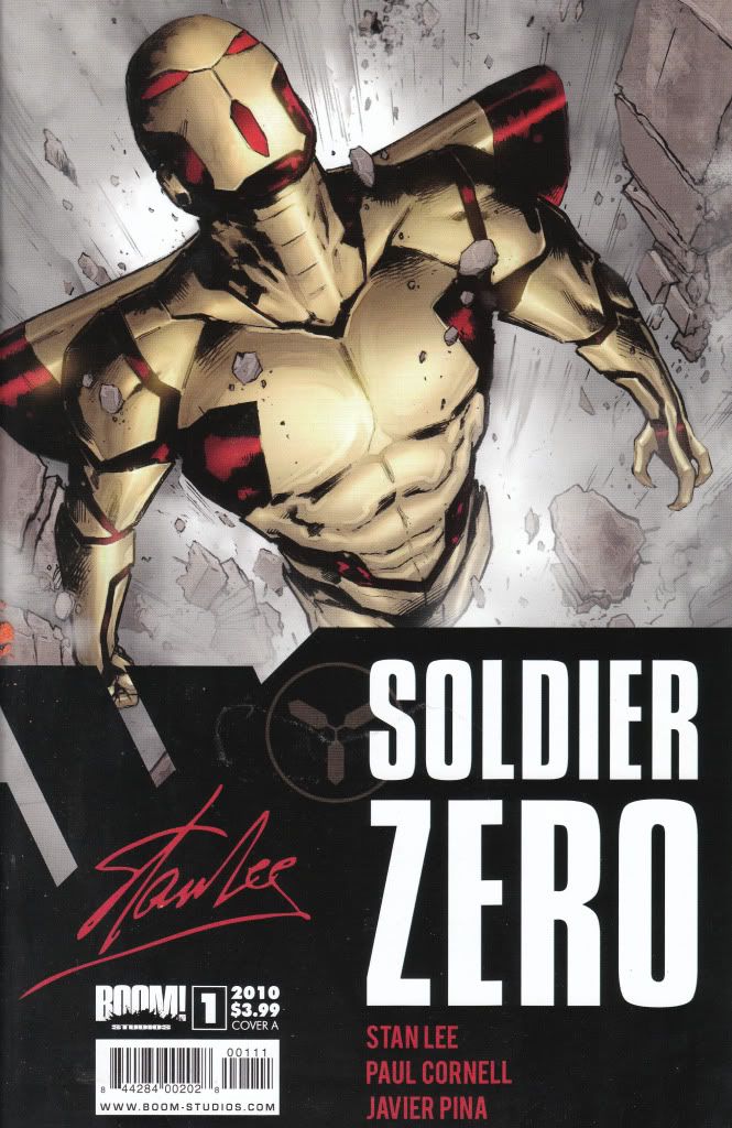
Soldier Zero #1 Boom Studios Writer - Paul Cornella Artist - Javier Pina We have 2 things happening in this story. We watch a wheelchair bound Stewart trying to score with Lily who seems like she wants to get with Stewart despite the fact that his back was broken when the truck he was riding in during the war ran over a dead animal with a mine in it and left him motionless from the waist down. Even though shes a babe, she still wants to be with him and he's naturally wanting to hook up. Even though he's admitted to her that his junk doesn't work either, she's still into the gig. The other part of this is watching what would be known as Soldier Zero fight some unknown enemy way up in the sky with no explanation and then he gets blasted and falls downward through the sky. How is it then that both actually meet? Well apparently Soldier Zero just happens to fall on the building that Stewart and Lily were on. Stewart doesn't have the strength to lift a massive piece of debris off himself and Lily is hurt and unconscious. For some unknown reason Soldier Zero decides to mold with Stewart and now Stewart can walk and lift debris. You know he immediately goes for Lily. But instead of being able to go immediately for help, now he's the alien freak who just fell from the sky. With Stan Lee's name plastered on this, I was hoping for something better but its cornier than anything he wrote in the 60s. The art is passable but nothing special either. I found I hated Soldier Zero once I seen his android looking legs. He looks way better on the cover than he does in the interior. He just looks stupid in the book. The #1 most distracting thing is the horrible use of computerized colors. Over vibrant, solids with colors bursting off the page, this color brings the book down to Zoom Suit levels and totally ruins any positive thing this book has going. Unfortunately there is a backup on The Traveler which I am also expecting to receive soon and it is looking the exact same way.....disappointing. This was probably more a novelty purchase and give it a chance type experiment than anything else. Sadly, this one issue totally ruins me wanting any further issues. It's too corny and the colors totally make me sick when I see it. This was a total letdown. I'd give it a 1.5 |
|
|
|
Post by cyberstrike on Nov 16, 2010 13:53:47 GMT -5
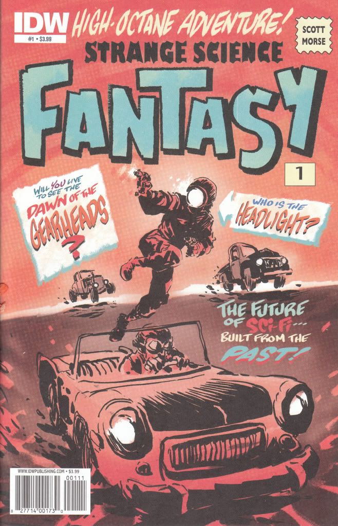
Strange Science Fantasy #1 IDW Story and Art - Scott Morse I can only think that my initial attraction to this book was the old style lettering on the cover. It looked like it was bringing back a glimpse from the past and the cover shot of this character Headlight looked both stupid and slightly interesting at the same time. Unfortunately, the cover tells you everything you need to know about this book. The art is this crappy throughout and told in pages with as little as 1 panel and as much as 3. The art is just slightly better than scribbles. The story is just as bad. Apparently the world has been reduced to nothing but a glorified Nascar race where there is no rules. Crashing and killing contenders is all part of the game. Enter headlight. For some unknown reason, he wins the races. This book moves along like you are supposed to just magically understand what is going on here or like you are supposed to care without any reason. Headlight's charm wears off as soon as you open the cover. There is nothing or nobody here to care about. There is no real characters to speak of. Just a mindless story going nowhere with art just as bad. When the best quality of the book is the paper it is printed on, you've got yourself a bad book. I can't see how this got published. This is one of those books that makes you realize what is wrong with comics. Standards are too low when a company like IDW lets something like this come out with their logo on it. My initial thought is to give this a 0.0, but having the belief that there might actually be even worse out there makes me be generous and give this book a 0.5..... I want my money back for this one.  "Scott Morse was trained at the California Institute of the Arts (commonly known as CalArts), where he majored in Character Animation. In his sophomore year he was hired out to work at Chuck Jones' Film Productions" By all means, close the school or refund his tuition. This should be published as a sketchbook, not a comic. Surely this guy can draw better than some throwaway project like this. Any theme that merges retro with future in a sci-fi story is written by people who don't know enough about science to write real sci-fi. df1 My problem with Scott Morse is that he was compared to Jeff Smith (of Bone fame) early in his career. The problem is Morse is nowhere near as talented as Smith. His work in a graphic novel Little Green Man was horrible my advice if his name is attached to a book then don't buy it. |
|
|
|
Post by G on Nov 28, 2010 23:55:25 GMT -5
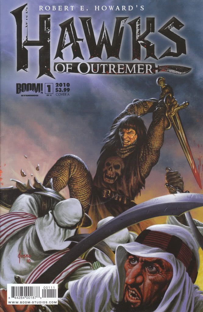
Hawks of the Outremer #1Boom Studios Writer - Michael Alan Nelson Artist - Damien Couceiro You pretty much know what to expect with any Robert E Howard adapted comic. Sword and Sorcery set in a Conan-like world. In this aspect, Hawk of the Outremer gives you more of what you're used to. Our hero, who instantly WILL remind you of Conan is none other than Cormac Fitzgeoffrey. He settles at a local tavern to tell his tales with a friend. He provides us a glimpse of a battle where he comes to the aid of a very accomplished fighter who will remind you of the Black Knight or Death Dealer. As he finishes his tale he asks his friend about Sir Rupert. Much to his dismay, he finds Sir Rupert has been killed by the Baron Conrad which brings Fitzgeoffrey in a revenge filled rage. He goes off to the castle which used to house Rupert and finds it guarded at the entrance moat by a sleeping Sentry. Fitz awakens him and demands the presence of the man of had Rupert killed. The Baron is a portley Coligula type who has his men do his dirty work for him while he feasts like a king. Fitz challenges Conrad to a fight which is met with rounds of laughter. What takes place next is certainly the most awesome scene in the comic and Fitz then turns to run to safety. The issue ends. This again is about what you would expect from such a book. This is sword and sorcery but with out the sorcery, at least in this issue. The read itself is enjoyable and moves along nicely. The art tells the story well. I wasn't blown away by it but it didn't aggravate me either. The colors get a bit warn out because they are sandy earth tones which give you that desert feel. Unfortunately, there isn't much feel for color otherwise. The real problem with this comic is you have to remind yourself constantly that this is NOT Conan even though every thing about it tells you it is. Fitzgeoffrey even looks like Conan and pretty much acts like him too. This to me is the only real downfall of the book. If you didn't seem the name or cover, you would never know you weren't reading a Conan book. As far as Conan books go. This was decently nice. But it didn't exactly leave me wanting more. If this is your kind of bag, I can recommend it. If this kind of thing isn't, I'd say there is no reason to buy it. It's well done enough to earn a 3.0. I actually kind of liked it. It just isn't my kind of comic.
|
|
|
|
Post by G on Nov 29, 2010 0:21:49 GMT -5
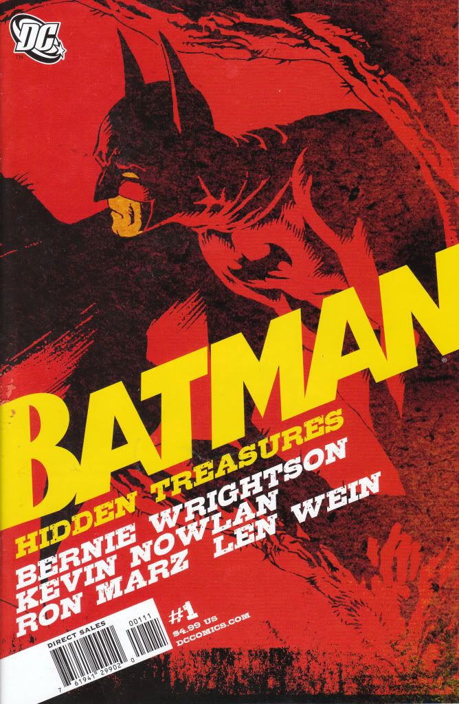
Batman Hidden Treasures #1DC Comics Writer - Ron Marz Artist - Bernie Wrightson It appears in the mid to late 90s, Bernie Wrightson created a Batman tale that takes place on nothing but single page splash pages. For some reason, it never made it to print and was originally passed around until now finding it's way to print. What happens is well below in the sewer systems of Gotham, murders are taking place with few clues. Batman shows up to follow the trail and runs into the reason itself, Soloman Grundy carrying yet another victim. Grundy easily makes Batman defenseless and has him watch as he completes another murder. But maybe these people deserved to die. I have to say the real reason I bought this was the hope that Wrightson kicked some butt doing this. While the images do appear nice, the feeling comes off that you get an incomplete comic. While it is certainly nice to have the artwork take place over nothing but splash-pages, the effect of splash page panels lose it's appeal when a book is totally made up of them. Instead of being a moment that deserves splash pages, we have to deal with moments that move the story along and have a splash page be the picture. This greatly loses the desired affect and what happens is we are delivered a very short story which reads more like a book with pictures than a comic. The end result is rather disappointing. The story isn't that great and the art doesn't exactly seem the best you can possibly expect from Wrightson. It's good, its just pedestrian in the grand scheme of things. He's capable of better. In the end, I felt a little ripped off. It doesn't help that the original Swamp Thing #7 is reprinted after this. When redone with computerized coloring, the mysterious effect that was early 70's DC Swamp Thing/Batman horror/action loses some of it's creepiness. I certainly didn't want to read it again. Especially looking watered down compared to what I originally remembered it. The cover price to this overstuffed letdown was $4.99. I would imagine though DCBS I probably paid about $2.50 or so for it. Even still, when I can get other comics of equal and easily better than this for a cheaper price, I couldn't help but feel ripped off once I read this very tiny but oversized pictures, lost Wrightson story. I also got stuck with not being able to choose covers and obviously ended up with the lesser of possibilities. If you're a tremendous Wrightson fan, I guess you'll be happy with this. But if you were looking for more than just a quick run through, you'll feel like I did. Let down. I'll let my final score be a 2.0. It's not bad stuff, it's just badly presented and totally not worth the cover price.
|
|
|
|
Post by G on Nov 29, 2010 12:03:34 GMT -5
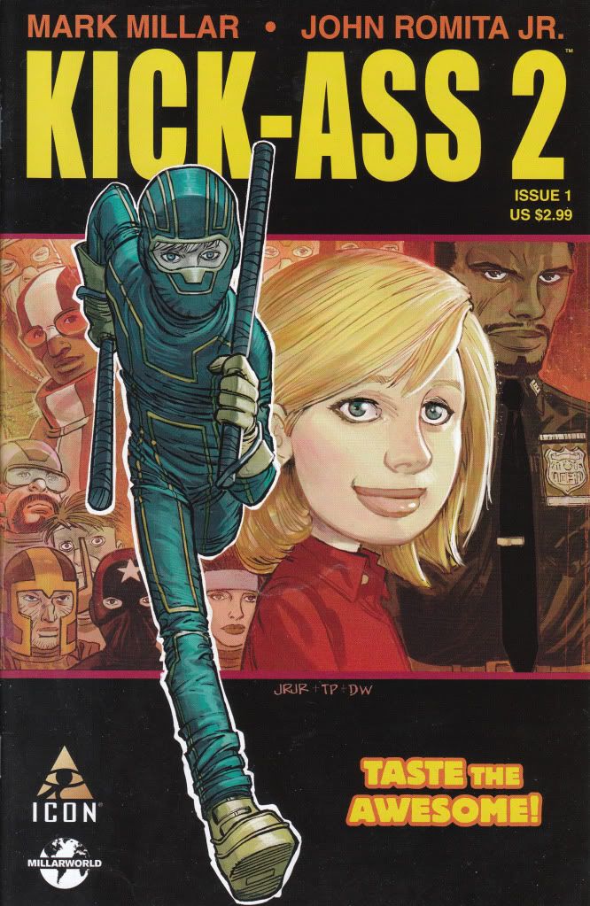
Kick Ass 2 #1 Marvel (Icon) Comics Writer - Mark Millar Artist - John Romita Jr. Kick Ass 2 appears to start where the movie left off. Hit Girl is training Kick Ass in her ways at fighting and is more than Kick Ass can handle, but she's eating it up. The two plan to become the world's first Super-Team, unfortunately, Hit Girl's guardian who happens to be a detective is onto what she is up to and makes her promise to quit being Hit Girl. This leaves Kick Ass back to doing patrols by himself and wondering why Hit Girl can't hang out. Kick Ass later takes a partnership run with a guy calling himself Dr. Gravity. He's digging how being a superhero is better than his real life reality of working a mundane job. Naturally the duo get jumped by a street mob who call them faggots and a nice beat down occurs. In the meantime Dr. Gravity tells Kick Ass he's been getting together with a group of other aspiring hero wannabees who he met through Myspace and asks him if he wants to join in to see a meeting. Kick Ass agrees and is taken to the secret meeting spot where he finds a large group just like him calling themselves Justice Forever. The comic ends there. Kick Ass is a lot of fun to read. It reads exactly how the movie watches. Gritty, funny and quick. You don't get bored. I know I've said differently before, but since we have discussed it here, I've looked stronger of the work of JR. JR. I've come to the conclusion that I'd rather see his work which renders fully dynamic and believable scenes with cartoonish styles over some tighter artists who deliver nothing but pose shots and boredom. JR JR is really as talented as he wants to be. I think his work is loose just so he can get the jobs finished. And if he managed to take his time, he could probably Kick Ass as much as the character in this book. There is an even nicer feature at the end of the book showing that JR JR did only the rough layouts and how Tom Palmer did nice finishes but still retained that JR JR feel. They further show how the page was colored and lettered. A very nice touch to witness. All in all, I rate this thoroughly enjoyable. No, it's no big time superhero story, but reads better than 90% of them anyway. And no the art aint as tight as I would like it, but damn it does a good job anyway. If you can get past the cartoonish looks of this book, this is a very well done comic. I'd rate this a 4.0 because it left me wishing I had more to read. Anytime I leave wanting to read more, I know a comic has done it's job. And this one did just that. |
|