|
|
Post by G on Nov 5, 2010 11:01:44 GMT -5
I've been trying a lot of new stuff lately because I feel the more I try the more I know what is what and can have an honest opinion on the books in question. I've been trying to spread it around and not just buy the usual things although I still buy those things too. So with that in mind, I'd like to start a review section that anybody can add to it. Most of my reviews will be new books, but if you'd like to review an old one, that is fine too. Personally, I'm going to give it a 5 star rating with .5's in between. As follows
0.0 - The worst piece of garbage ever created
0.5 - Wouldn't recommend it to anybody
1.0 - Really bad, but may have had 1 redeeming quality
1.5 - More bad than good, but had moments
2.0 - Almost thought it was okay, but not quite
2.5 - Average run of the mill comic, neither passes nor fails
3.0 - It was pretty good, but it could have been a lot better
3.5 - This was actually good, but something was holding it back
4.0 - Damn good book, would recommend it, but not for everybody
4.5 - Probably as good as it gets in most cases.
5.0 - Hardly anything should be this great. Instant classic.
This will be my own personal rating system. You can use it for yourself or create your own. I'm just using it for me, but feel free to use it if you'd like.
I'm sure all of us reads something, so please use this as a sounding board for what you've been reading. Great reviews give others a heads up in case they were thinking of getting it. And, some may disagree with you altogether. Perhaps that will be good for discussion.
Now....on with the reviews! ;D
|
|
|
|
Post by G on Nov 5, 2010 11:40:16 GMT -5
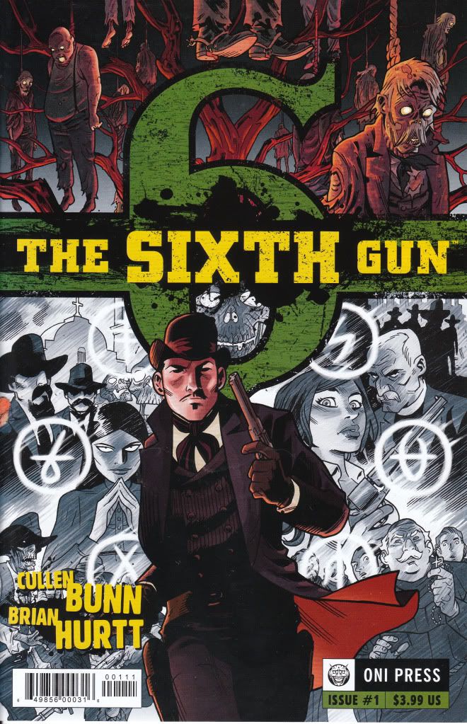
The Sixth Gun #1 Oni Press Writer - Cullen Bunn Artist - Brian Hurtt I typically don't buy anything from Oni Press as well as I'm not much on Westerns because so many disappoint. But this book caught my eye when I was ordering and I decided to give it a shot. I actually have and read both #1 and #2. I have to say, I was pleasantly surprised with this book. The book involves the hunting down of a mystical Six Gun and whoever possesses it has special abilities including blessed aim. There is also an undead portion to the book as spirits cannot rest peaceably until certain conditions are met. The hunt, the battle scenes and the fill in scenes all move at a great pace. The story is fun and the art is very good. Sure, there is better examples of art out there, but this is art with great movement and storytelling and not a slave to a style. It's perfect for this book. In the end, I wished I had the remainder of the series. I was quite happy reading this. I'd rate it 4.0 out of 5. Unless you're just dead set against Westerns and Horror, this is comics a lot like they used to be. Imaginative, Fast and Fun! A pleasant surprise for today's standard of comics. |
|
|
|
Post by G on Nov 5, 2010 11:57:17 GMT -5
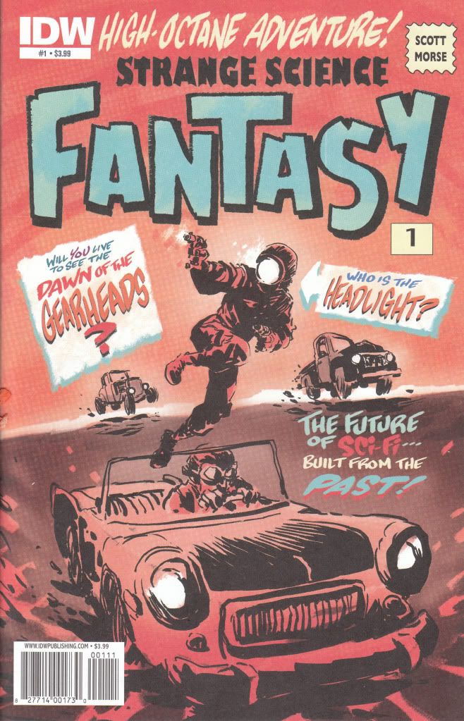
Strange Science Fantasy #1 IDW Story and Art - Scott Morse I can only think that my initial attraction to this book was the old style lettering on the cover. It looked like it was bringing back a glimpse from the past and the cover shot of this character Headlight looked both stupid and slightly interesting at the same time. Unfortunately, the cover tells you everything you need to know about this book. The art is this crappy throughout and told in pages with as little as 1 panel and as much as 3. The art is just slightly better than scribbles. The story is just as bad. Apparently the world has been reduced to nothing but a glorified Nascar race where there is no rules. Crashing and killing contenders is all part of the game. Enter headlight. For some unknown reason, he wins the races. This book moves along like you are supposed to just magically understand what is going on here or like you are supposed to care without any reason. Headlight's charm wears off as soon as you open the cover. There is nothing or nobody here to care about. There is no real characters to speak of. Just a mindless story going nowhere with art just as bad. When the best quality of the book is the paper it is printed on, you've got yourself a bad book. I can't see how this got published. This is one of those books that makes you realize what is wrong with comics. Standards are too low when a company like IDW lets something like this come out with their logo on it. My initial thought is to give this a 0.0, but having the belief that there might actually be even worse out there makes me be generous and give this book a 0.5..... I want my money back for this one.  |
|
|
|
Post by G on Nov 5, 2010 12:36:23 GMT -5
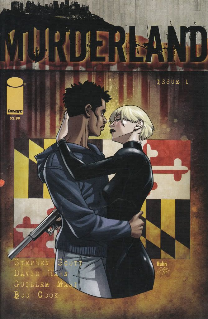
Murderland #1 Image Comics Story - Stephen Scott Art - David Hahn I tend to respect Image more when they get away from their core group of original characters. I find some of their other stuff is a far cry from the books I used to loathe so badly by them. Sometimes Image can surprise so I continue to give it chances. It's hard for me to judge Murderland yet. One issue didn't give me enough to pass total judgment on this. The story seems cryptic and wanting to fill you in as you go along. I would imagine the more you read this book the clearer it becomes. Best I can tell, the story revolves around the feminine character of Arabber who lives her life like an actress. She changes her looks and rolls at will. She lives the storylines and she prays on victims, like her seemingly indestructible black boyfriend who she looks like she kills in the opening scene, but we find out years later that they work together and sleep together and no matter how badly this guy is gutted, he lives. The ambush fight scene they become involved in is where the story gets murky for me. They proceed to kick each other's ass and the bad guy winds up in custody with a head halo on. When he is questioned, he proclaims "Go find yourself an Arabber". The issue ends there. I'm sure following issues fill the gaps on this storyline. There is probably enough here to make sense out of it all, but honestly, it doesn't read well enough 1st time through to take it all in immediately. The art is not bad. Tells the story well with good angles and atmosphere but done in a cartoonish and slightly manga style. Its just slight enough that it doesn't bother me. If the styles had been any stronger, it would have been a total distraction. As it is, its not bad. It's not great either. It works for the story. I would like to give Murderland a chance. It appears to have a bit of promise but I'm not willing to shell out more money on it to find out I was wrong. And it doesn't seem strong enough to make me think it'll be worth it even if I was right. I think my money is spent better elsewhere. I think some people will like it and some will hate it. I'd give it a 3.0....It wasn't bad. I think it just needs more pages to be read to like it better. It has potential. It also looks like it could go easily into the land of sucks. Issue #1 was just a tease. An incomplete. Not enough to truly judge it. Buy with caution. |
|
|
|
Post by G on Nov 5, 2010 13:38:19 GMT -5
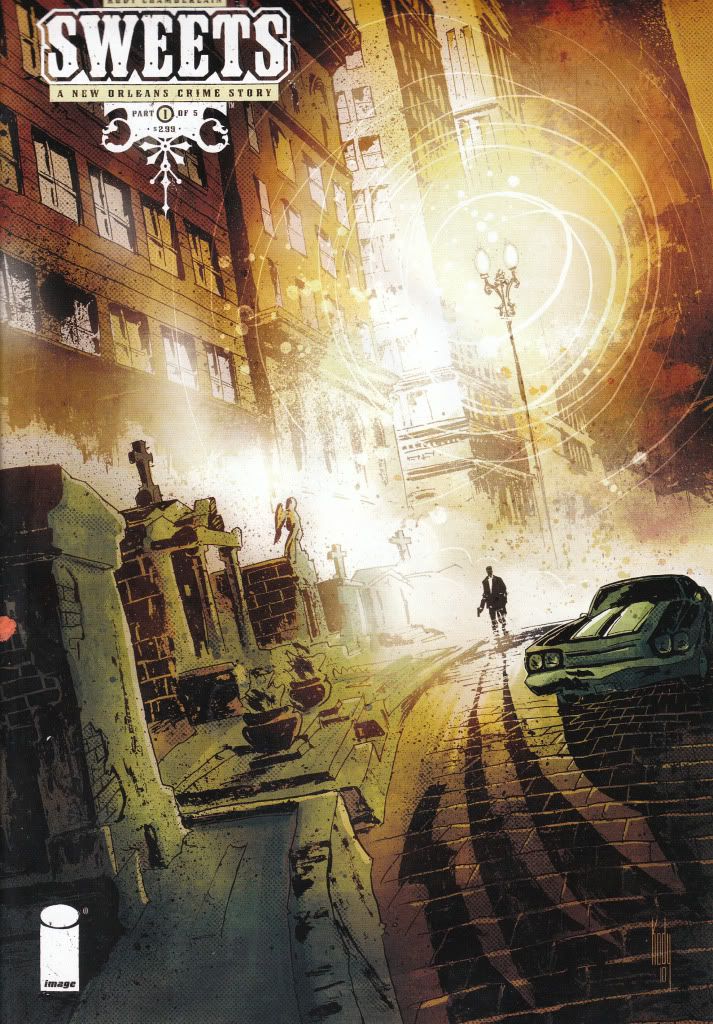
Sweets #1 Image Comics Story and Art - Kody Chamberlain Sweets is a detective type comic set in the shadowy land of New Orleans. There has been a string of murders, most recently a well respected priest who happened to be the priest to the Mayor. The Mayor is sweating out the police chief's balls over it. He in turn is sweating his top detectives, one of which is AWOL because just weeks ago his daughter was killed and now his wife wants to leave him. The Chief doesn't care. Get him back on the job or he's fired. The two detectives meet up and begin to pursue the murder plot. As the two get closer to the action we see that there is also corruption at the higher levels of the law. The issue ends with the back cover looking like the next issue the detectives uncover another murder. It also ends with a one page letter from the writer/artist proclaiming he has been working on the story for years and didn't want to start penciling it until he worked out all the finer details of the story and made sure it was a top notch script. Gotta say, it's pretty good. The mood of this story is like watching a good old detective show (not a bad one) that moves briskly from one scene to the next. The art is on the average side. Nothing special about the art, but for the type of story it is, the shadowy rough drawings go great with the story. Its a good match. The story however, is better than the art and makes the art seem better than it actually is. Unlike Murderland, Sweets seems clear to read and I can easily say this is good. If I had a lot of expendable cash, or I can find it in back issue bins later, I'll pick the rest of these up. As it is, I'll leave myself wondering how this turns out for the time being. I will say, it's very promising. I'd give this a 3.5. Personally, it's more like a 4.0, but when I think in terms of others, I'd have to knock it down a notch because not everybody is gonna dig a detective type comic and the art is also not exactly top notch, so it's easy to see how others would frown on this. But if you can dig just about any type of comic like I can, I'd say this is better than average and worthy of a chance. |
|
|
|
Post by G on Nov 5, 2010 14:54:09 GMT -5
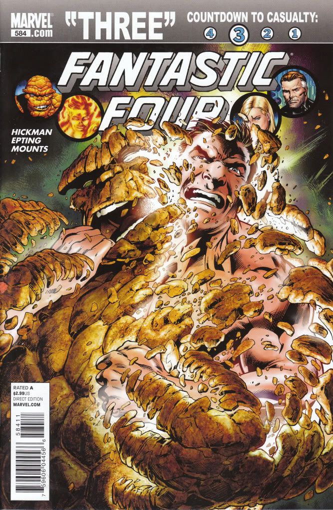
Fantastic Four #584 Marvel Comics Writer - Jonathan Hickman Artist - Steve Epting I have to admit when it comes to comics today, I find myself a tremendous fan of Steve Epting. Easily one of my favorite artist drawing today. When I heard he was taking the art chores of one of my collecting favorite titles, The Fantastic Four, I was more than a little excited to check it out. The story begins with The Thing trying a new serum which gives him back his normal human look for 1 week a year every year. The serum works and Ben and Johnny spend the day doing things normal humans would do. Ben soaks up the normal experience including kissing Alicia as a human and fighting the updated Yancy Street gang. Meanwhile Sue takes a trip and meets Cyclops, Emma Frost and most notably Sub Mariner. And lastly Reed has a run in with the Silver Surfer who is looking for answers on why Galactus was killed, only Galactus isn't killed. He's right there. This is how the story ends, with the Galactus moment being a cliffhanger. The story moved well, but seemed very loose. I read this in mere minutes. It was a bit disappointing. Likewise, Epting's art seemed a bit rushed. I'm used to his art looking far more photogenic than this. Luckily it got progressively better as the story went on, but overall I was a bit disappointed. He did a TON better on Captain America. I can only hope he picks it up as he continues on this series. Being I'm a fan of both the Fantastic Four and Epting, I was going in ready to give this one a knock out score. As it is, I'd have to give it a 3.0. Maybe a 3.5. The cliffhanger with Galactus looked good, but it wasn't enough to be overly impressed with this effort. |
|
|
|
Post by G on Nov 5, 2010 16:48:29 GMT -5
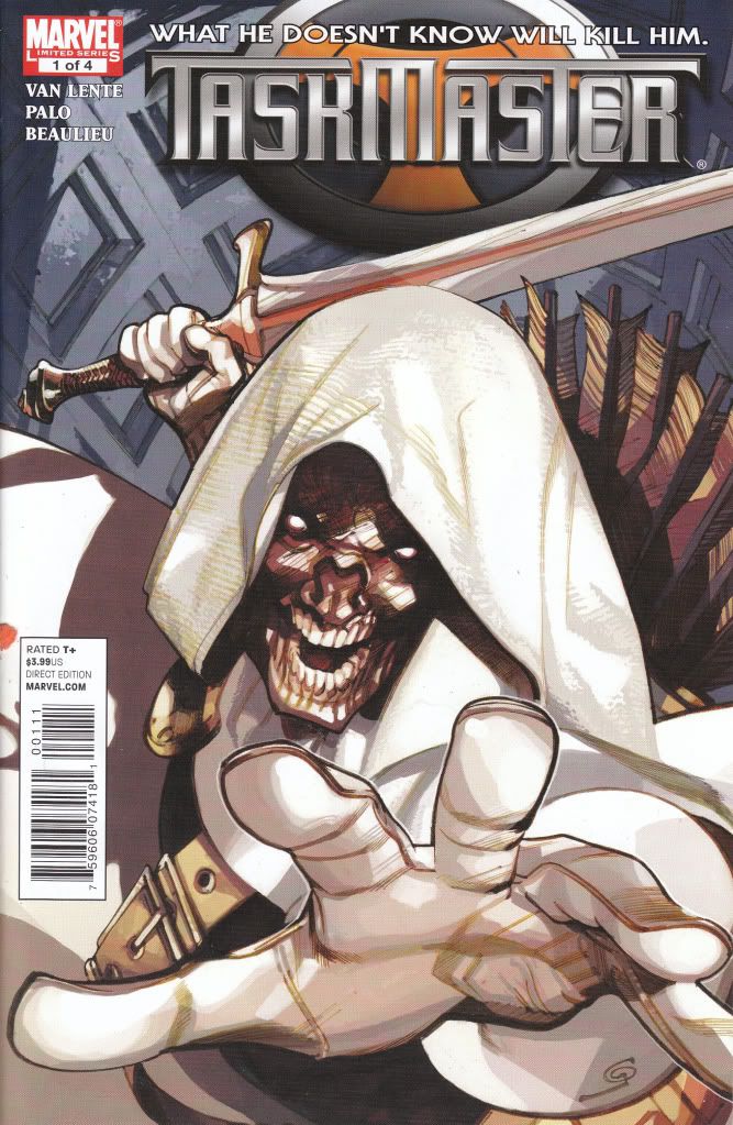
The Taskmaster #1 Marvel Comics Writer - Fred Van Lente Artist - Jefte' Palo The Taskmaster somehow appears as a civilian in a diner talking with a waitress about earliest memories. She confides in him and then asks him his earliest memory, he says coming in here. Seems the Taskmaster has memory problems but he's still able to recognize sniper gangs when they are waiting to get him. He sends the waitress off to ask the cook for a recipe and then all hell breaks loose as every group of bad guys are trying to collect on a bounty on The Taskmaster placed on him by the Org. This makes the waitress a innocent target as someone who appears to have connections with him. Just when things look bleak for her, Taskmaster saves the day. I gotta say, I'm not a fan of seeing bad guys play the role of good guys. This absolutely shows Taskmaster as an awesome kick ass, but the story seems better suited for a known good guy than the Taskmaster. It slightly takes some of the bad ass out of him. The art is another complaint. It's not bad and tells the story okay, but its way too stylized and comes off like so many crap comics copying crap styles. You take the stylized part of it out and he did a good job. As it is, it looks crappy to me. The overall book isn't bad, just don't want to see Taskmaster in this role and drawn this way. A good story gets dragged down with wrong art and wrong character. This makes me give it a 2.5. Could have easily been a 3.5 with different characters and artist. A sheep-herd type of book in my opinion. Baaaaaaaa! |
|
|
|
Post by G on Nov 5, 2010 17:36:26 GMT -5
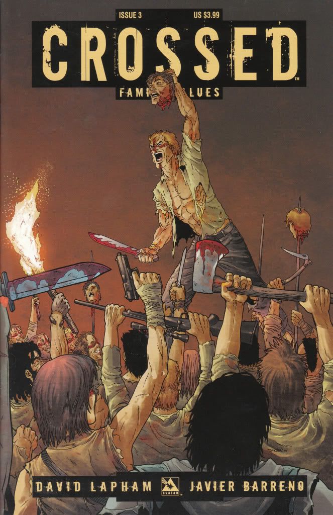
Crossed Family Values #3 Avatar Press Story - David Lapham Art - Javier Barreno I remember the first time I seen Crossed I brushed it off as stupid and didn't want nothing to do with it. Every time I seen a cover it was reminding me of something else like maybe Preacher and riding it's coat-tails at first glance. But every time I seen this book, it kept looking more and more interesting. I had to admit, the more I seen it, the more I liked the covers. I finally had to give one a chance. I'm not going to pretend I totally understand this story yet. I've obviously missed out on the build up to what is taking place now. But there appears to be a Zombie-Like group with a Cross on their face and plain regular folks trying to survive against them. Sounds like your typical Zombie type book and if left at that, I think this book would be so-so. However, this book is over-the-top shock value and its coming off as insanely fun. I almost feel bad for liking this book. I know better. But dammit, this was fun. The pleasant thing about this book was even though I didn't understand the complete story from it's inception, this one issue which was just one part of the total history, was self contained enough to be a good story on its own. I didn't have to know the whole history. I just opened the book up, found myself in a scene and just sat back and enjoyed the insanity. And insane it was! I didn't care who I was supposed to care for, I just sat back and watched the book be as shocking and disgusting as it wanted to be. It almost felt like the guys who made this are going to hell. That's why I almost felt bad for enjoying it. And the art was equally fun. No, it wasn't the best thing I ever seen. But damn, it was solid storytelling art. And done well. It was a damn fine piece of work. By time I finished this book, I was a fan and have to admit, I want more. Maybe I'm the sheep here. I guess I am. But, I had good time reading this. For me personally it was a 4.5, but I'll give it a final grade of 4.0. If you ain't into shock and gore and insanity, this ain't for you. Maybe there is worse out there and there probably is, but this was fun enough for me. I can't recommend this for everybody, but if you ain't put off by such antics, I say buy it! |
|
|
|
Post by defiant1 on Nov 6, 2010 9:10:33 GMT -5
Sweets #1 Image Comics Story and Art - Kody Chamberlain Sweets is a detective type comic set in the shadowy land of New Orleans. There has been a string of murders, most recently a well respected priest who happened to be the priest to the Mayor. The Mayor is sweating out the police chief's balls over it. He in turn is sweating his top detectives, one of which is AWOL because just weeks ago his daughter was killed and now his wife wants to leave him. The Chief doesn't care. Get him back on the job or he's fired. The two detectives meet up and begin to pursue the murder plot. As the two get closer to the action we see that there is also corruption at the higher levels of the law. The issue ends with the back cover looking like the next issue the detectives uncover another murder. It also ends with a one page letter from the writer/artist proclaiming he has been working on the story for years and didn't want to start penciling it until he worked out all the finer details of the story and made sure it was a top notch script. Gotta say, it's pretty good. The mood of this story is like watching a good old detective show (not a bad one) that moves briskly from one scene to the next. The art is on the average side. Nothing special about the art, but for the type of story it is, the shadowy rough drawings go great with the story. Its a good match. The story however, is better than the art and makes the art seem better than it actually is. Unlike Murderland, Sweets seems clear to read and I can easily say this is good. If I had a lot of expendable cash, or I can find it in back issue bins later, I'll pick the rest of these up. As it is, I'll leave myself wondering how this turns out for the time being. I will say, it's very promising. I'd give this a 3.5. Personally, it's more like a 4.0, but when I think in terms of others, I'd have to knock it down a notch because not everybody is gonna dig a detective type comic and the art is also not exactly top notch, so it's easy to see how others would frown on this. But if you can dig just about any type of comic like I can, I'd say this is better than average and worthy of a chance. My first impression: A comic about a street lamp. They are so busy drawing a nice picture that they don't market the product or entice a reader. df1 |
|
|
|
Post by defiant1 on Nov 6, 2010 9:12:52 GMT -5
The Sixth Gun #1 Oni Press Writer - Cullen Bunn Artist - Brian Hurtt I typically don't buy anything from Oni Press as well as I'm not much on Westerns because so many disappoint. But this book caught my eye when I was ordering and I decided to give it a shot. I actually have and read both #1 and #2. I have to say, I was pleasantly surprised with this book. The book involves the hunting down of a mystical Six Gun and whoever possesses it has special abilities including blessed aim. There is also an undead portion to the book as spirits cannot rest peaceably until certain conditions are met. The hunt, the battle scenes and the fill in scenes all move at a great pace. The story is fun and the art is very good. Sure, there is better examples of art out there, but this is art with great movement and storytelling and not a slave to a style. It's perfect for this book. In the end, I wished I had the remainder of the series. I was quite happy reading this. I'd rate it 4.0 out of 5. Unless you're just dead set against Westerns and Horror, this is comics a lot like they used to be. Imaginative, Fast and Fun! A pleasant surprise for today's standard of comics. I can't stand the art on the cover. I don't care about the story when the art is that distracting. df1 |
|