|
|
Post by defiant1 on Apr 4, 2015 11:35:36 GMT -5
This was an unfinished piece from around 2000. I tinkered around with a scan of it digitally and removed some word balloons I'd done in pencils and added some word balloons with Paint Shop Pro.  df1 |
|
|
|
Post by G on Apr 6, 2015 14:17:48 GMT -5
This is a good example. You give enough in the picture to give you a good feel for where you are and what's going on. Combined with the fact that the expressions are right and the small details on her dress and location of the tree give the whole thing depth. Your words take over from there and it all flows together nice and believable with the humor actually working. I wouldn't mind you drawing at this quality level to allow a story to play out as a comedic strip story. I would think it would be enjoyable.
|
|
|
|
Post by G on Apr 6, 2015 14:49:38 GMT -5
I was feeling a little bit of confidence coming off the Robin Williams picture but once again not sure what to draw next. Being I had done 2 basic bust type portraits, I was looking to expand my horizons and try and go after a bit more. I was getting impatient looking for a good pic to draw and in a rush I settled on this one. Wish I hadnt. To begin with, all the drawing at this point are being drawn on simple office printing paper, so size of the picture came into play. I'm drawing 2 full figures instead of 1 head shot and this time trying to give some sense of a background. The scaling is not projected or traced or anything. I'm scaling it by eye. This made all the details much smaller which also has affects. The faces are probably less than 1 inch each in height. This makes it harder to get a likeness with much smaller and few lines. Being I draw this at work, some nights I only get a few lines in because I might be busy. A couple days into I want to scrap it but I keep finding myself placing more lines on it and now I'm too committed and I've got to finish. In the end, I know it's inferior to what came before it and when I post on Facebook I like wise get way fewer likes and only a couple of comments. I feel at the time I may have tried biting off more than I could chew and trying to push it in a direction I'm not quite yet ready to explore yet. In the end, I'm let down by this but also trying to appreciate that a lot of work was still done here and I at least came reasonably close. I put just as much effort into this one and yet it looks the most rushed and sloppy. In the end once I sign it I'm pretty much saying I'm done and it's time for me to move on. There always comes a point where the work it takes to make it better is probably not worth the time because my talent at this point won't take it much further anyway. Nope, it's time to come to peace with it and move on. And thinking for the good of what I'm trying to accomplish in the big picture, it is time for me to move on.  |
|
|
|
Post by defiant1 on Apr 6, 2015 17:54:32 GMT -5
This is a good example. You give enough in the picture to give you a good feel for where you are and what's going on. Combined with the fact that the expressions are right and the small details on her dress and location of the tree give the whole thing depth. Your words take over from there and it all flows together nice and believable with the humor actually working. I wouldn't mind you drawing at this quality level to allow a story to play out as a comedic strip story. I would think it would be enjoyable. I had a serialized cartoon published for two years in the Atlanta Sideshow magazine. For many of those months, 2 were published. On some months, the publisher may have cut my cartoon out to make room for a pseudo-celebrity interview. I have a completed "comic book" drawn in this style. The earliest pages are me literally sitting down and trying to draw something with absolutely no art training at all. Anything with depth was a freaking nightmare. The heads were oval so I could use a oval template to draw them. Somewhere I'd been told that drawing a character has more to do with making them recognizable and being able to repeat the task. Before I put pencil to paper, I practiced the shape of the head that I wanted. I quickly learned that the problem with drawing an oval head was depicting it from different angles. It's still a problem for me, but I kept drawing the cartoons anyway. If I recall correctly, I drew the comic book first with the intent to self-publish it one day. One of my friends suggested submitting cartoons to the Atlanta Sideshow where he was writer. I thought it might be a good idea to market my character by doing that. My hope was to wet people's appetite by letting them see a serialized story, then sell them a comic book. An amazing thing happened. My art skills got better! Not to the level I wanted, but sometimes I'd have moments where my art looked exactly like I wanted it to. Here is a page with some unpublished pieces. I've drawn better, but these pieces came together faster than others I drew in the beginning. 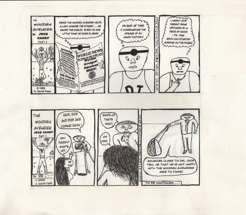 Regardless, I got nothing but praise and encouragement. The people who scoffed at me shut up and started complimenting me to others behind my back. Considering I had ABSOLUTELY NO ART TRAINING AT ALL... I think I did okay. I admitted that my art looked like crap. As you say though, the text moved the panels forward. There are also little quirky things like the character with the golf clubs. My intent was to never draw him without a golf club in his hand. If I was to draw him on a toilet, he would still have a golf club in his hand. He'd use it as a cane, point with it, hit people with it, but he'd always have it. df1 |
|
|
|
Post by defiant1 on Apr 6, 2015 18:16:14 GMT -5
I was feeling a little bit of confidence coming off the Robin Williams picture but once again not sure what to draw next. Being I had done 2 basic bust type portraits, I was looking to expand my horizons and try and go after a bit more. I was getting impatient looking for a good pic to draw and in a rush I settled on this one. Wish I hadnt. To begin with, all the drawing at this point are being drawn on simple office printing paper, so size of the picture came into play. I'm drawing 2 full figures instead of 1 head shot and this time trying to give some sense of a background. The scaling is not projected or traced or anything. I'm scaling it by eye. This made all the details much smaller which also has affects. The faces are probably less than 1 inch each in height. This makes it harder to get a likeness with much smaller and few lines. Being I draw this at work, some nights I only get a few lines in because I might be busy. A couple days into I want to scrap it but I keep finding myself placing more lines on it and now I'm too committed and I've got to finish. In the end, I know it's inferior to what came before it and when I post on Facebook I like wise get way fewer likes and only a couple of comments. I feel at the time I may have tried biting off more than I could chew and trying to push it in a direction I'm not quite yet ready to explore yet. In the end, I'm let down by this but also trying to appreciate that a lot of work was still done here and I at least came reasonably close. I put just as much effort into this one and yet it looks the most rushed and sloppy. In the end once I sign it I'm pretty much saying I'm done and it's time for me to move on. There always comes a point where the work it takes to make it better is probably not worth the time because my talent at this point won't take it much further anyway. Nope, it's time to come to peace with it and move on. And thinking for the good of what I'm trying to accomplish in the big picture, it is time for me to move on. I don't see anything wrong with this other than the like weights being too heavy on Robert Plant's face. df1 |
|
|
|
Post by G on Apr 8, 2015 2:35:46 GMT -5
Yeah, I redrew both of those faces about 10 times each. Any line added or taken away made major differences in the way each of them looked. I had to just settle for this. The line thickness on the face is about the line thickness of the pencil lead. This is 1 disadvantage of using mechanical pencils. You can only get as thin as the thickness of the lead.
I've found myself wishing that I could find a full range of mechanical pencils that had both lead shade gradations from pencil to pencil (something currently available for standard pencils but not mechanical) as well as have mechanical pencils with a full array of lead thicknesses. .7mm seems to be the standard. I think I've seen some .9s and maybe a .5 but that is about the extent of it.
Standard #2 pencils really work nice but the problem with those is trying to keep those sharp all time. Trying to do it with a crude pencil sharpener doesn't seem to do the trick. You need an electrical pencil sharper you can access at will. And I can't go back and forth to the pencil sharpener at work. So I'm stuck using standard mechanical pencils to draw the picture and then #2 pencils in various shades to flesh it out. I believe this is one reason my line weights suck. There is so many easier to establish tools for an inker to achieve line thickness but not for the penciler himself. At least not that I've easily seen.
|
|
|
|
Post by defiant1 on Apr 8, 2015 22:22:12 GMT -5
Yeah, I redrew both of those faces about 10 times each. Any line added or taken away made major differences in the way each of them looked. I had to just settle for this. The line thickness on the face is about the line thickness of the pencil lead. This is 1 disadvantage of using mechanical pencils. You can only get as thin as the thickness of the lead. I've found myself wishing that I could find a full range of mechanical pencils that had both lead shade gradations from pencil to pencil (something currently available for standard pencils but not mechanical) as well as have mechanical pencils with a full array of lead thicknesses. .7mm seems to be the standard. I think I've seen some .9s and maybe a .5 but that is about the extent of it. Standard #2 pencils really work nice but the problem with those is trying to keep those sharp all time. Trying to do it with a crude pencil sharpener doesn't seem to do the trick. You need an electrical pencil sharper you can access at will. And I can't go back and forth to the pencil sharpener at work. So I'm stuck using standard mechanical pencils to draw the picture and then #2 pencils in various shades to flesh it out. I believe this is one reason my line weights suck. There is so many easier to establish tools for an inker to achieve line thickness but not for the penciler himself. At least not that I've easily seen. I've always used 0.5. Anything bigger feels like I'm drawing with a crayon. Well, that is after I quit inking with a laundry marker and sharpies! LOL! df1 |
|
|
|
Post by G on Apr 16, 2015 7:14:03 GMT -5
Dicks Up! That's What!! Best line on the page! This is a good example. You give enough in the picture to give you a good feel for where you are and what's going on. Combined with the fact that the expressions are right and the small details on her dress and location of the tree give the whole thing depth. Your words take over from there and it all flows together nice and believable with the humor actually working. I wouldn't mind you drawing at this quality level to allow a story to play out as a comedic strip story. I would think it would be enjoyable. I had a serialized cartoon published for two years in the Atlanta Sideshow magazine. For many of those months, 2 were published. On some months, the publisher may have cut my cartoon out to make room for a pseudo-celebrity interview. I have a completed "comic book" drawn in this style. The earliest pages are me literally sitting down and trying to draw something with absolutely no art training at all. Anything with depth was a freaking nightmare. The heads were oval so I could use a oval template to draw them. Somewhere I'd been told that drawing a character has more to do with making them recognizable and being able to repeat the task. Before I put pencil to paper, I practiced the shape of the head that I wanted. I quickly learned that the problem with drawing an oval head was depicting it from different angles. It's still a problem for me, but I kept drawing the cartoons anyway. If I recall correctly, I drew the comic book first with the intent to self-publish it one day. One of my friends suggested submitting cartoons to the Atlanta Sideshow where he was writer. I thought it might be a good idea to market my character by doing that. My hope was to wet people's appetite by letting them see a serialized story, then sell them a comic book. An amazing thing happened. My art skills got better! Not to the level I wanted, but sometimes I'd have moments where my art looked exactly like I wanted it to. Here is a page with some unpublished pieces. I've drawn better, but these pieces came together faster than others I drew in the beginning. Regardless, I got nothing but praise and encouragement. The people who scoffed at me shut up and started complimenting me to others behind my back. Considering I had ABSOLUTELY NO ART TRAINING AT ALL... I think I did okay. I admitted that my art looked like crap. As you say though, the text moved the panels forward. There are also little quirky things like the character with the golf clubs. My intent was to never draw him without a golf club in his hand. If I was to draw him on a toilet, he would still have a golf club in his hand. He'd use it as a cane, point with it, hit people with it, but he'd always have it. df1 |
|
|
|
Post by G on Apr 16, 2015 9:08:05 GMT -5
 I decided after my Zeppelin drawing I needed to go back to more my style. So about this time, 1 of my all-time favorite shows was about to cancel, Boardwalk Empire. It lasted 5 awesome seasons. The first 3 were epic. The last 2 was strong but as strong as the first three. The 4th was the worst season and it was pretty damn good it's own. This here is the main character Nucky Thompson played by Steve Buscemi. What a badass. As the show came to an end, I couldn't help but feel nostalgic, so I drew him. I felt pretty good about this one but there are little things that bug the hell out of me when I see them lime this. Nonetheless, although a few bad spots, overall I enjoyed doing this one. |
|
|
|
Post by defiant1 on Apr 17, 2015 1:06:34 GMT -5
Dicks Up! That's What!! Best line on the page! It took people awhile to catch the humor. There's that moment of doubt where they aren't sure how to take what I said. Eventually, there is a connection and they know what I'm going to say before I say it. They don't come back to read it. They come back to verify that they were right. df1 |
|